COMPSCI 194-26: Computer Vision and Computational Photography
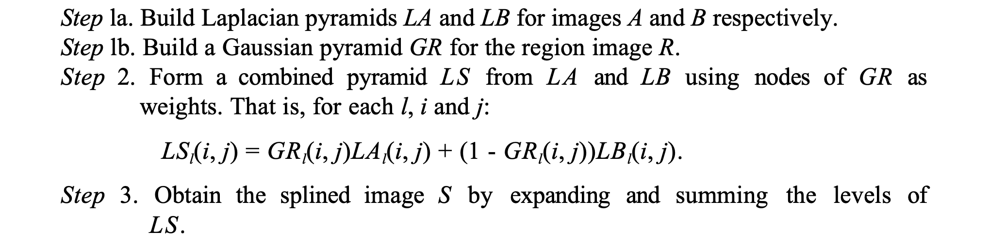
Varun Saran
Links
Home
The following is an overview of each project. Click the links on the left to read more about each project, see some implementation details, and more examples.
Project 1: Colorizing Images
Project 2: Image Hybridization and Multi-Resolution Blending
Image Hybridization
By filtering out low frequencies on 1 image, and high frequencies on the other image, we can create a hybrid image. From close by (or when the image is big), this looks like the first image, and from far away (when the image is small) it looks like the second image. Here is the exact same image twice, scaled to different sizes so they look like completely different images.
Project 3: Facial Morphing
By selecting facial feature correspondences, we can morph one face into another.
Project 4: Auto-Stitching Images
Using the Harris interest point detector, we find all corners in 2 images. We then use feature descriptors and RANSAC to find corresponding corners in both images. Once we have enough points, we use least squares to find the transformation matrix defining the homography, and can then stitch the 2 images together.


Project 5: Facial Keypoint Detection
I trained a neural net to detect 58 keypoints on any human face
Final Project: AR and Gradient Domain Fusion
Part 1: AR
Using the Harris corner detector, I tracked corners in a video. With a known transformation between each frame, I then used image projection to project an AR cube onto a 2D video of the world.
Part 2: Gradient Domain Fusion
Gradient Domain Fusion is matching the gradients of 2 images, so they can be smoothly blended without any high frequency seams that stand out.
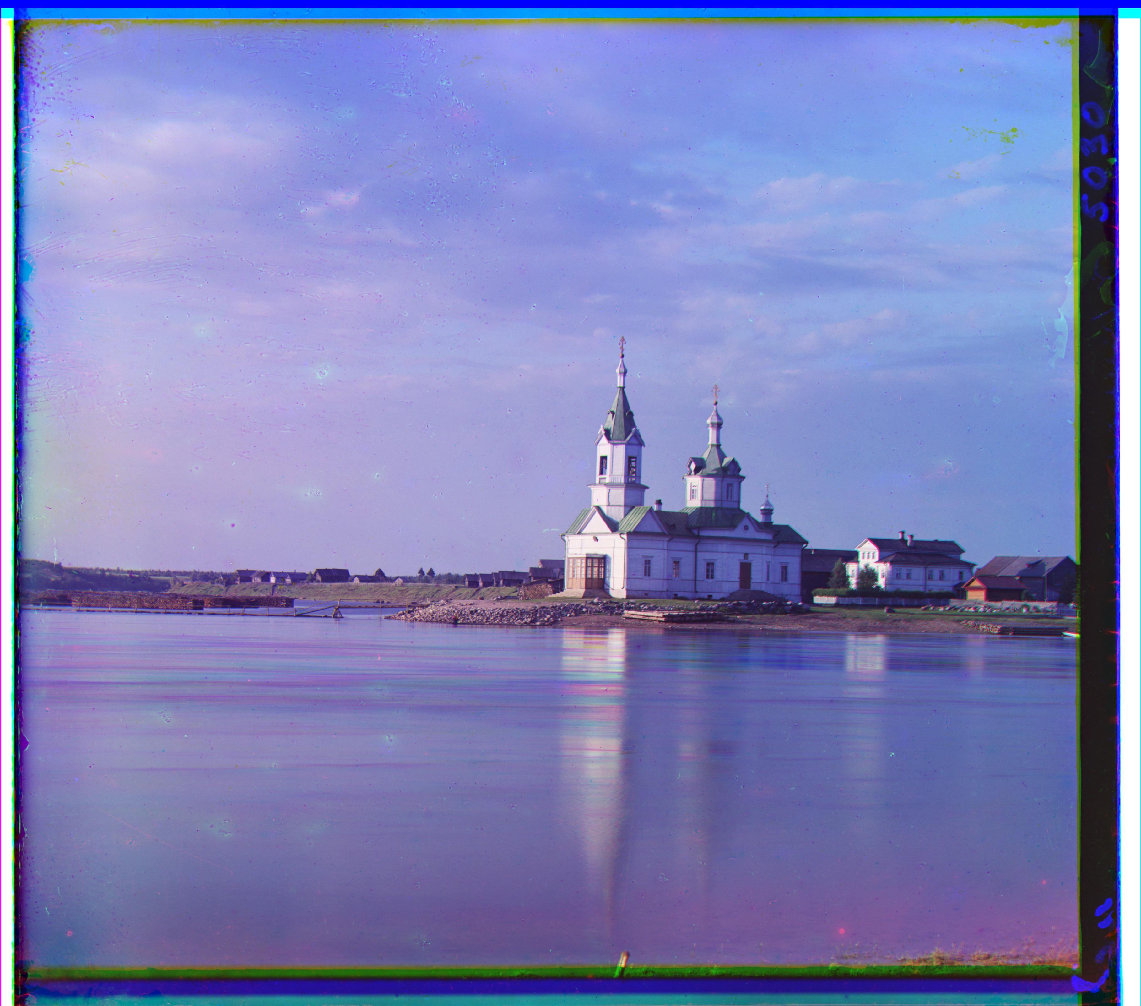
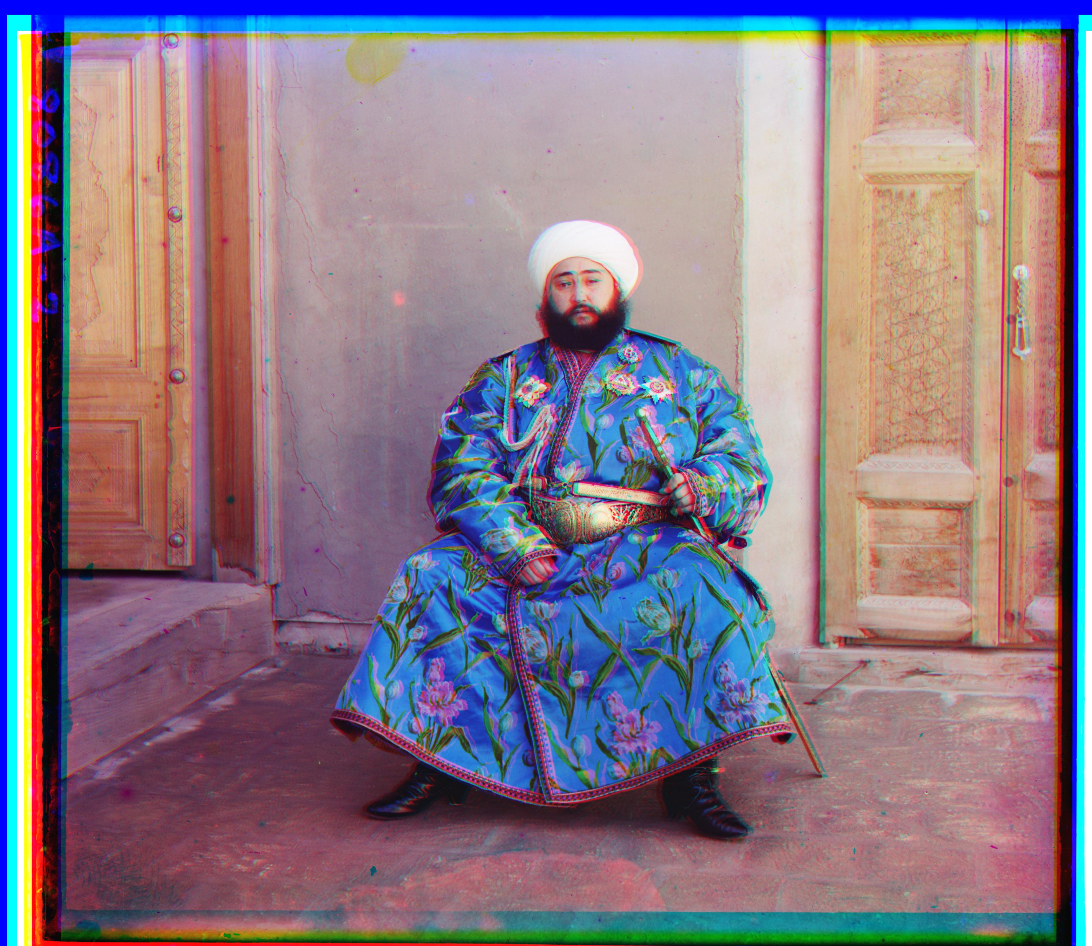
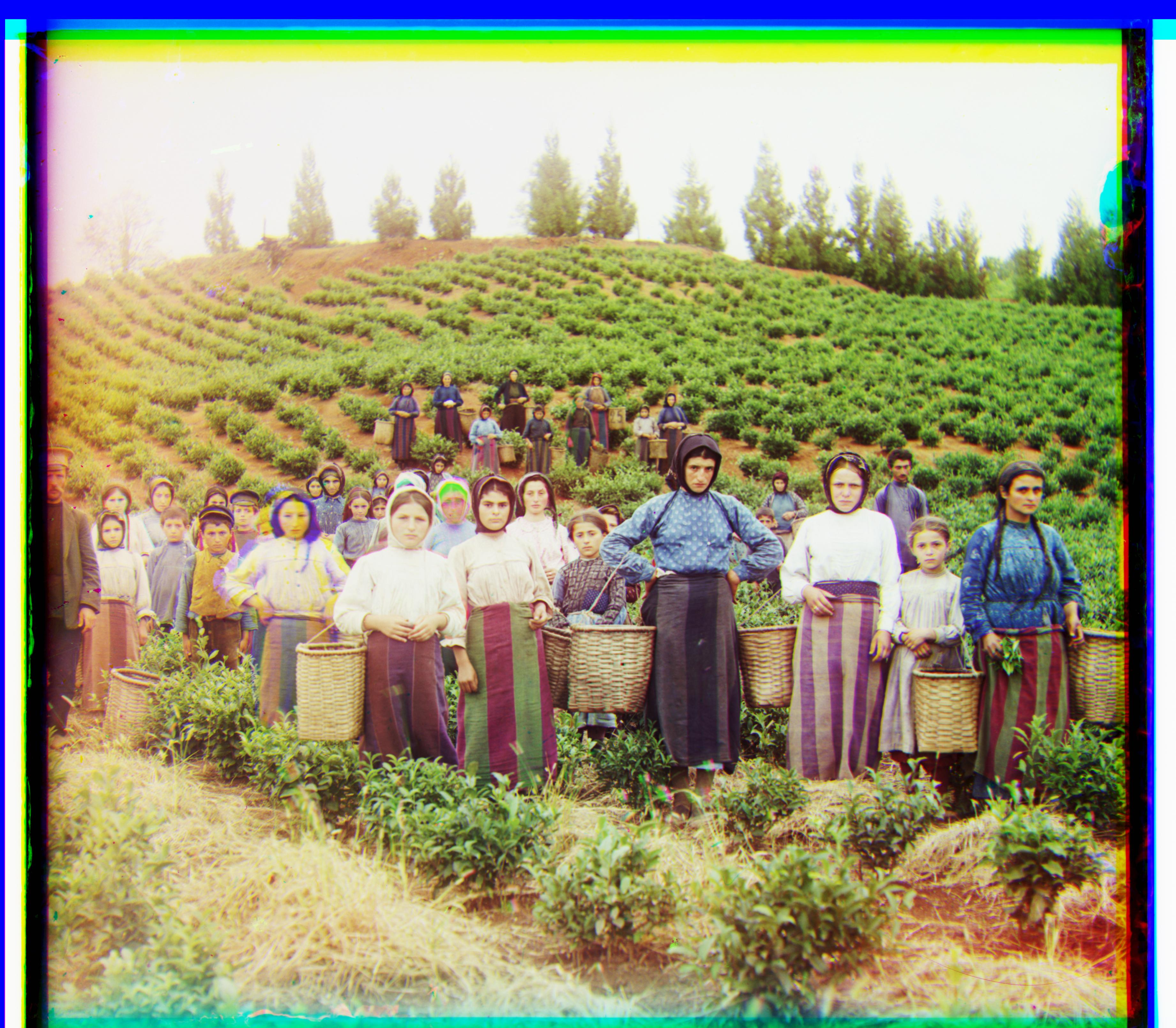
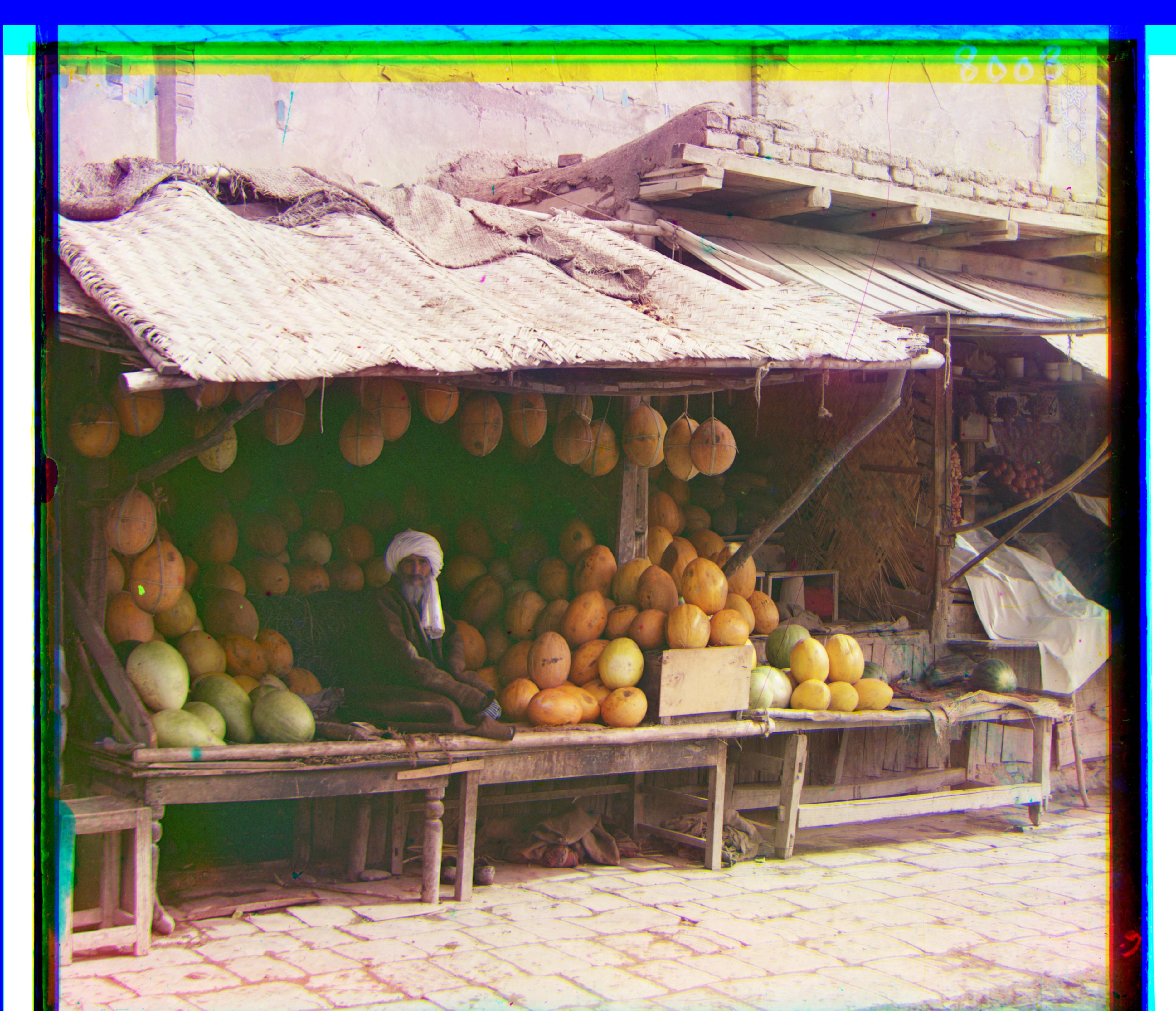
Project 1: Images of the Russian Empire: Colorizing the Prokudin-Gorskii photo collection
Background
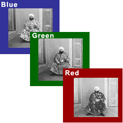
The Prokudin-Gorskii Collection
Sergei Mikhailovich Prokudin-Gorskii was a man well ahead of his time. Convinced, as early as 1907, that color photography was the wave of the future, he won Tzar's special permission to travel across the vast Russian Empire and take color photographs of everything he saw including the only color portrait of Leo Tolstoy. And he really photographed everything: people, buildings, landscapes, railroads, bridges... thousands of color pictures! His idea was simple: record three exposures of every scene onto a glass plate using a red, a green, and a blue filter. Never mind that there was no way to print color photographs until much later -- he envisioned special projectors to be installed in "multimedia" classrooms all across Russia where the children would be able to learn about their vast country. Alas, his plans never materialized: he left Russia in 1918, right after the revolution, never to return again. Luckily, his RGB glass plate negatives, capturing the last years of the Russian Empire, survived and were purchased in 1948 by the Library of Congress. The LoC has recently digitized the negatives and made them available on-line. In this project, I attempt to combine these seemingly black and white images with different color filters, into a single colored image.
Naive Exhaustive Search using Similarity Metrics
A simple stacking of the 3 channels is not good enough because each channel is slightly different, due to either the environment changing ever so slightly, or just the camera moving between different clicks. So before we can stack the channels, we must try to align them. To do this, I tried two different similarity metrics: Sum of Squared Differences (SSD) and normalized cross-correlation (NCC). SSD is the L2 norm of the difference of 2 channels, where a higher score represents a greater difference between images. So lower scores are better. NCC is the dot product between two normalized vectors. To convert 2D images into vectors, I flattened them and then compared them. Since they are normalized vectors, a perfect match would have a dot product of 1, and the score gets closer to 0 as the images get more and more different. So a higher score is best. To find the best alignment, I used an exhaustive search over a range of [-20, 20] pixels in both the x and y direction. Based on my testing, I found that NCC performed significantly better than SSD. So for all (small) images, I ran SSD with exhaustive search.
Cropping
The borders of each of the channels are slightly chaotic and don’t line up well. Using these values would make our similarity metric return haywire results. So before we do anything, I cropped off 15% of the image on all 4 sides. This gets rid of the noisy borders, and only uses good, reliable, internal pixels. In addition, when translating a channel, part of the image is filled with 0s. This made NCC give strange results. I started with a color image, split it into 3 images, and translated the R channel by (10, 10) followed by (-10, -10). In theory, ncc should return a perfect match. But it didn’t, and even thought a non (0,0) translation gave better results. So whenever I translated an image, I cropped out the amount by which it was translated to ensure there are no extra 0s. As I write this report, I realize I could have used np.roll to roll the borders to the other side, instead of the WarpAffine shown at the python tutorial. While this wouldn’t have changed the results by much, it should save some time by not having to crop part of the image every time it is translated (done 1600 times for an exhaustive search over [-20, 20]
Exhasutive Results on JPEG images
Here are some results on smaller (.jpeg) images:
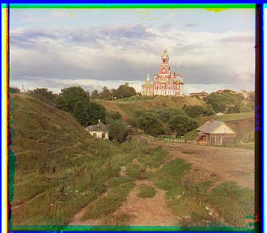
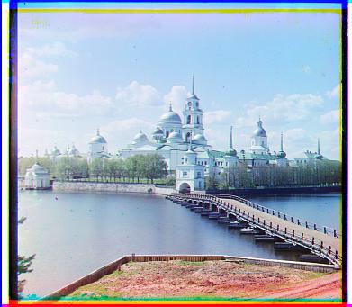
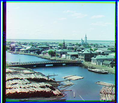
Image Pyramids to speed up search on bigger images
On bigger images, this technique doesn’t work as well because we expect bigger translations than a max of 20 in x or y. Increasing the range beyond [-20, 20] makes exhaustive search extremely slow as it searches every x,y combination, resulting in x*y runs. To speed this process up, I used a coarse-to-fine image pyramid. An image pyramid contains the original, high quality image at the base of the pyramid, and then as you work your way up, the image is rescaled to be smaller than before. So at the top of the pyramid, is the coarsest, lowest quality image. We first run the original exhaustive search on the coarsest image to get an initial estimate of the translation needed to align the image. We then work our way down the pyramid, only trying translations near the one returned by the level above. If the layer above us returned a translation of (50, 50), we know that there’s no point trying translations like (-75, -40) which our original exhaustive search would have done. So we can just focus on translations around (50, 50), and we save a lot of time in this way.
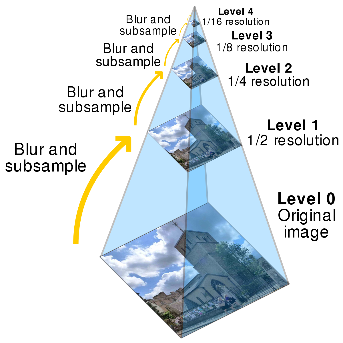
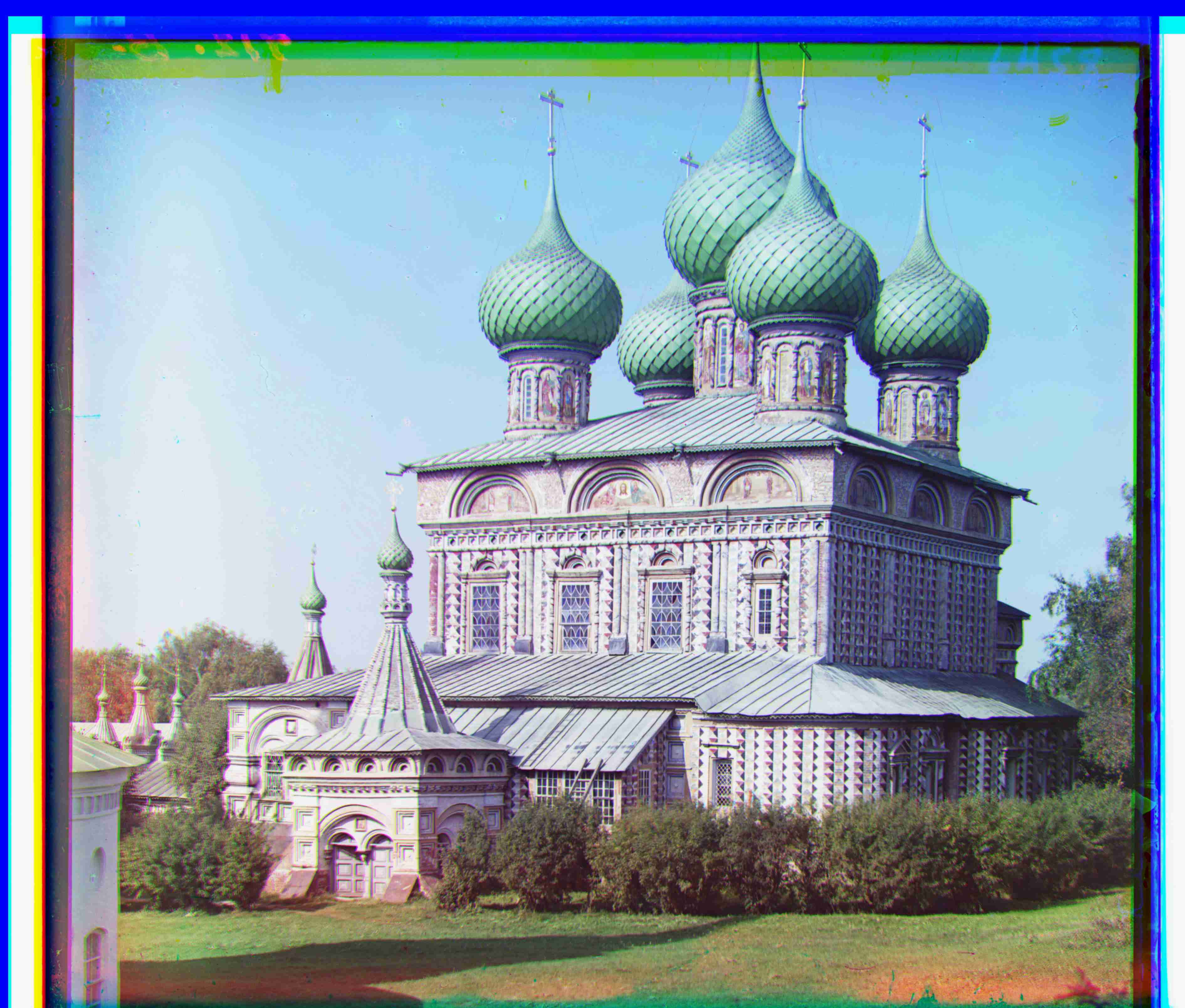
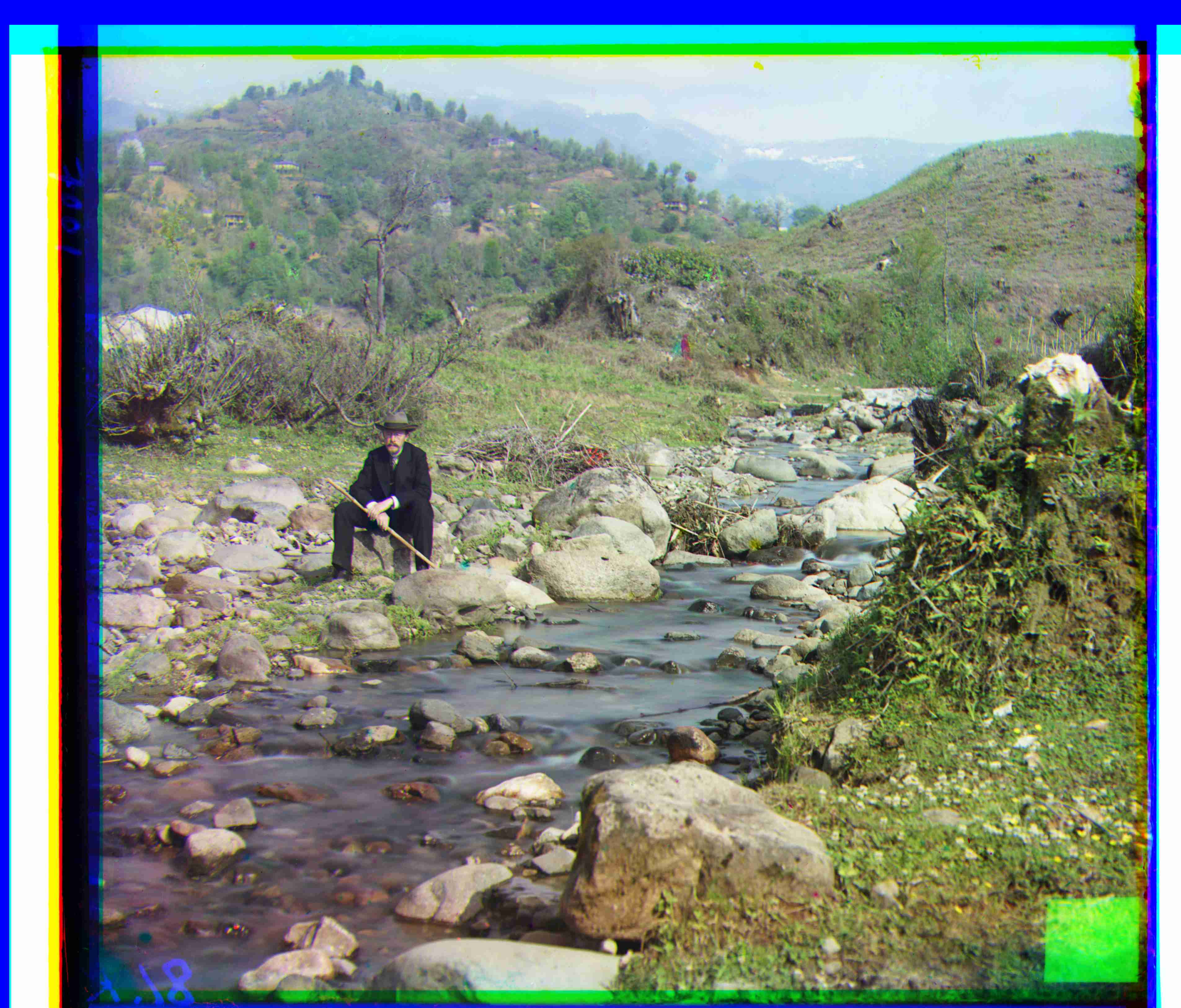
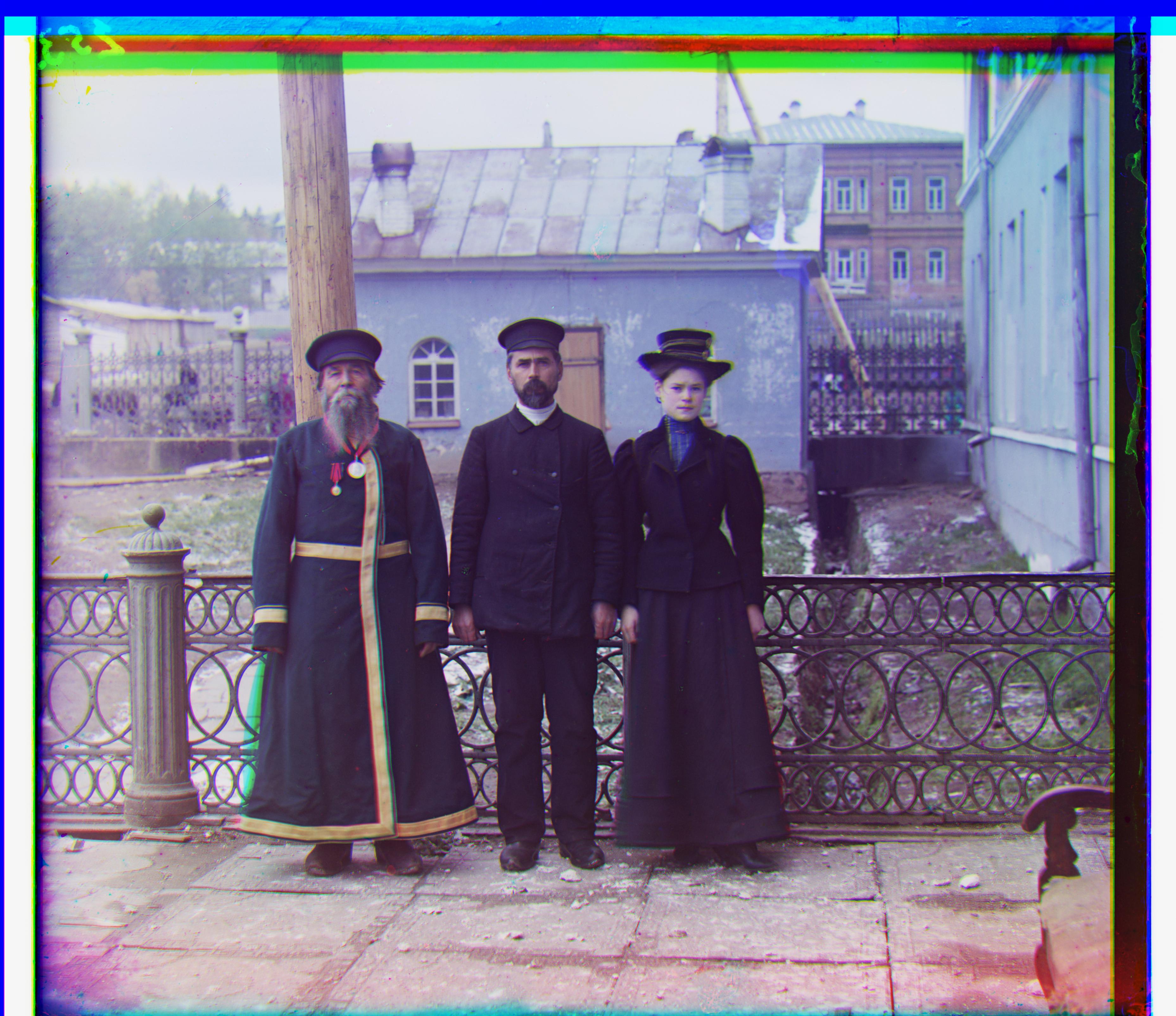
Image Pyramid Results on TIFF images
Here are some results on big (.tif) images:
Additional Results
Here are some results on images outside of those given in the .data folder of the project spec (these images can be found here):


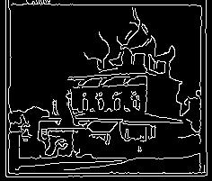
Edge Detection
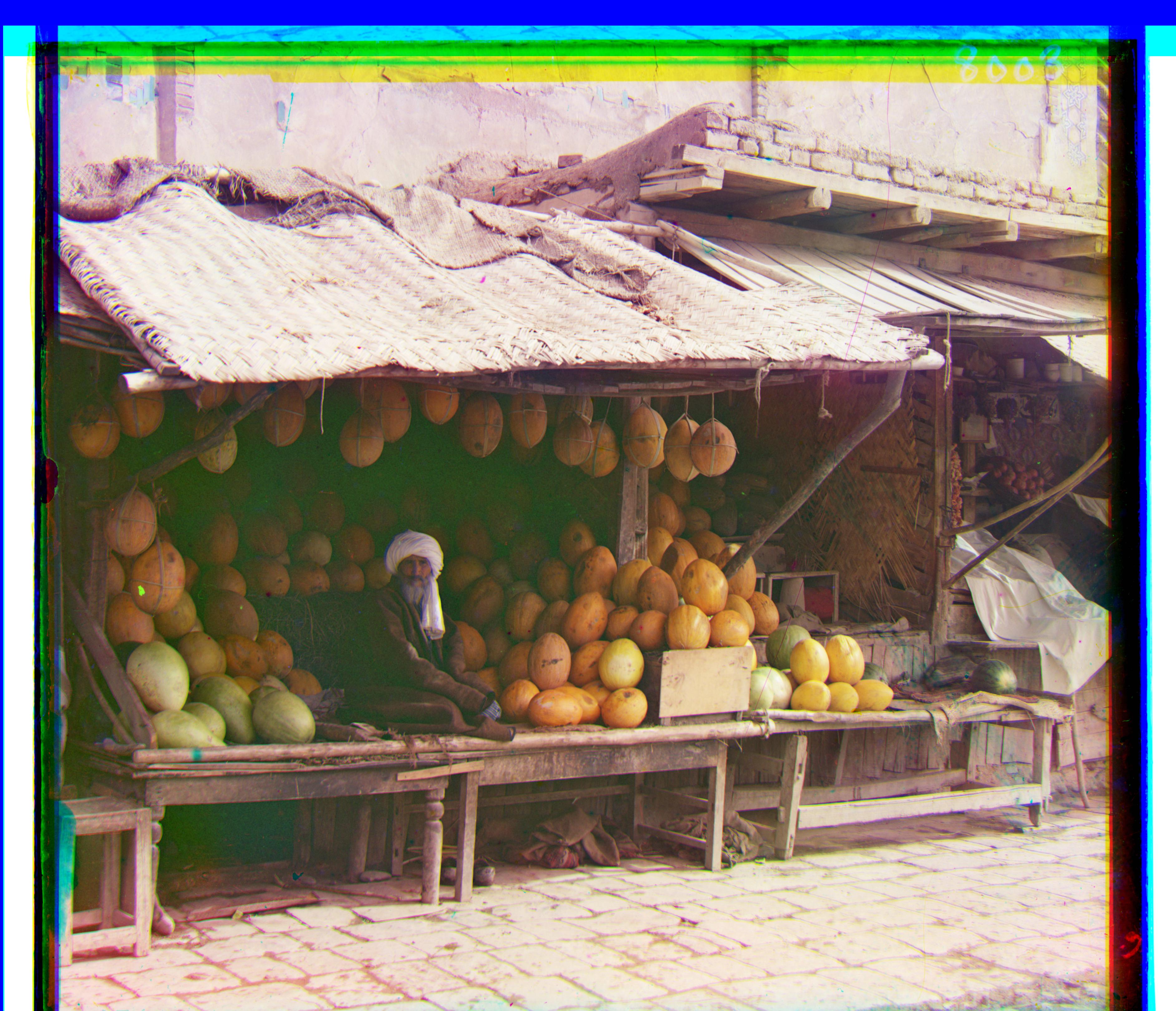
For the main assignment, we used the raw pixel values of each channel. However, this isn’t the best metric because pixel values don’t need to be the same across different channels. In fact, if they were, the 3 channel stacked image would be grayscale. A better metric to align images is to first find the edges in the image (which tell a simpler story about the image), and then lining up 2 images with only edges. I used Canny edge detection, and here are some results: Using edges worked best with SSD over NCC, and was a bit faster than the naive NCC alignment. For the regular image pyramid, due to time restrictions, I had to use the values from the 2nd from the bottom layer (not the bottom-most = finest layer), so the final translation wasn't based off of the highest quality image. With edge detection and SSD, it ran fast enough that I could go all the way to the bottom. This adds some minor accuracy to the pictures we use, and is expected to add much more accuracy to bigger pictures where naive NCC might be too slow. Here is an example of melons.tif, using naive NCC versus edge detection with SSD. The difference is not visible, but there is a couple pixel difference due to the extra run on the highest quality layer of the image pyramid.
And here, we can see the effect of using edge detection on our image pyramid. Instead of comparing background pixels and other noisy information, we are only comparing the most important information (and what I use as reference when determining whether the image is actually aligned). This means our similarity metric (SSD in my case) is only affected by important pixels. This also helps us visualize the usefulness of the image pyramid. In the first image, we can just kind of tell whats going on, and in each next layer, we get more and more information. But even the coarser images are good enough to get a decent estimate of how to align an image.
Part 1.1: Finite Difference Operator
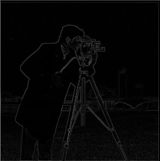
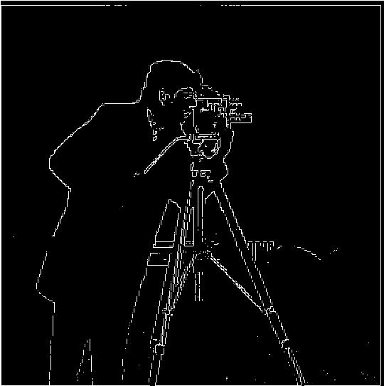
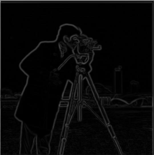
Using derivates to get edges. The gradient magnitude image is created by first taking the partial derivative of the image with respect to x and y separately, using Dx = [1, -1] and Dy = [ [1], [-1]]. These were used as filter to convolve with the image. The resulting 2 images are the first 2 images displayed. Then, to create the gradient magnitude image, the 2 gradients are combined to get grad_image = sqrt (grad_x^2 + grad_y^2). Finally, the image is binarized to reduce noise and emphasize the edges by qualitatively choosing a threshold, and setting all values less than the threshold to 0, and all above it to 1 (or 255, depending on the format of the image)
In this section, we don't blur the image before taking the gradient.
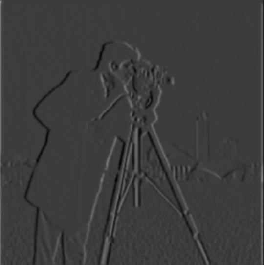
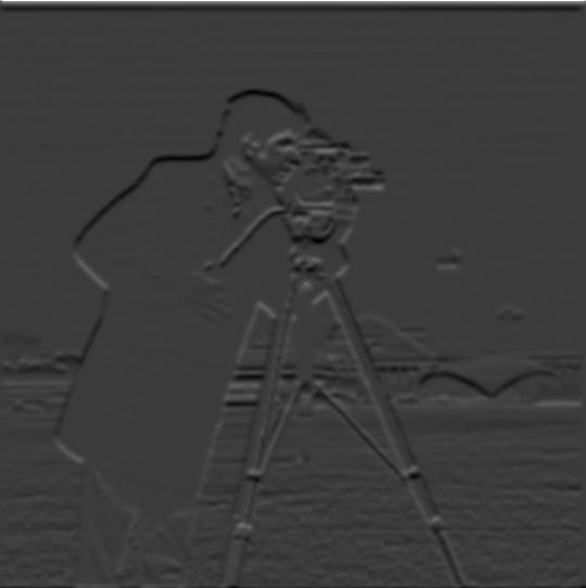
Part 1.2: Derivative of Gaussian (DoG) Filter
Using derivates to get edges. In this section, we do blur the image before taking the gradient.
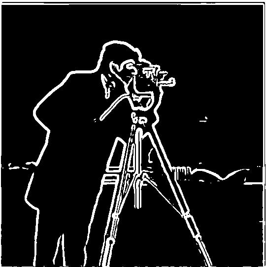
Q1. What differences do you see?
The image is alot clearer, and the gradient image is a lot smoother. No more rapid zig zags to make curves (as seen in part 1.1, may require zooming in). Instead, the edges actually look like curves.
Now, we use a single convolution to blur the image and take the derivative using a derivative of gaussian filter.
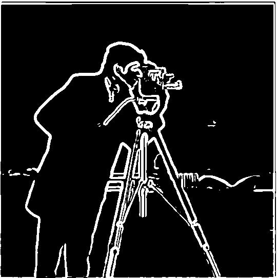
Yes, result is the exact same. No information is lost, and convolutions are commutative so order doesn’t matter. This just speeds things up because we aren’t convolving with a big image twice.
Sharpening Images
here, we use the low pass filter, and subtract it from the original image to get a high pass filter (an image with only high frequncies aka edges). We can add this high frequency image to the original image to sharpen the image. We can scale the high frequency image by a scalar to increase its affect. sharpened_image = original_image + alpha *(original_image - blurred_image)

Sharpening Images using a single convolution filter
Now, instead of 2 convolutions, we combine the filters first, and then do a single convolution with the image. this should have the same results, and take much less time.
Sharpening Images
Now, I use my own image of a bird. The original image is very sharp. I first low-passed it to get a blurry image, and then used the blurry image to find the high frequency edges to manually sharpen the (blurred) image. As alpha increases, the images get more and more sharp, until it gets overdone.

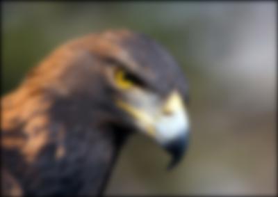
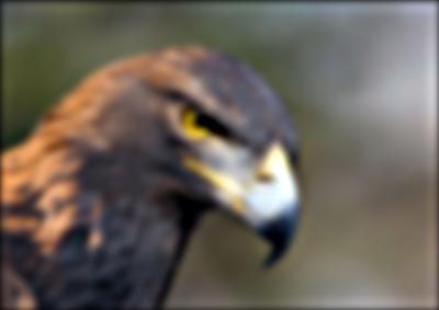

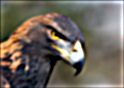
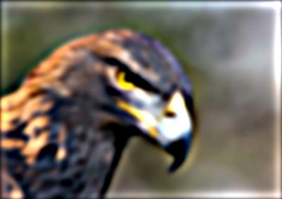
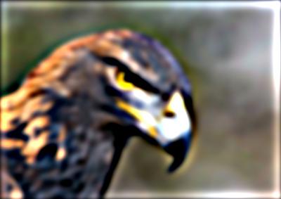
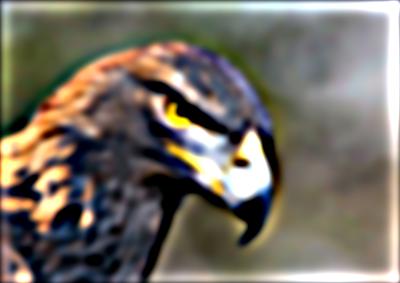
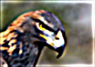
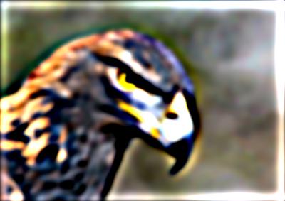
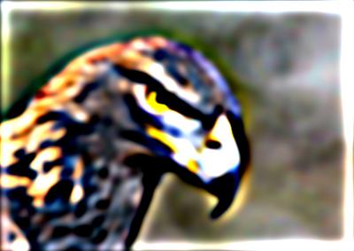
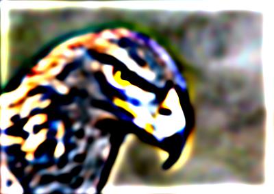
alpha = 3 or 4 seems to be the best sharpened image and closest (though understandably nearly not as good) to the original super sharp image.
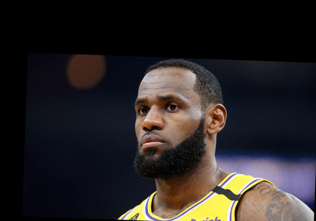
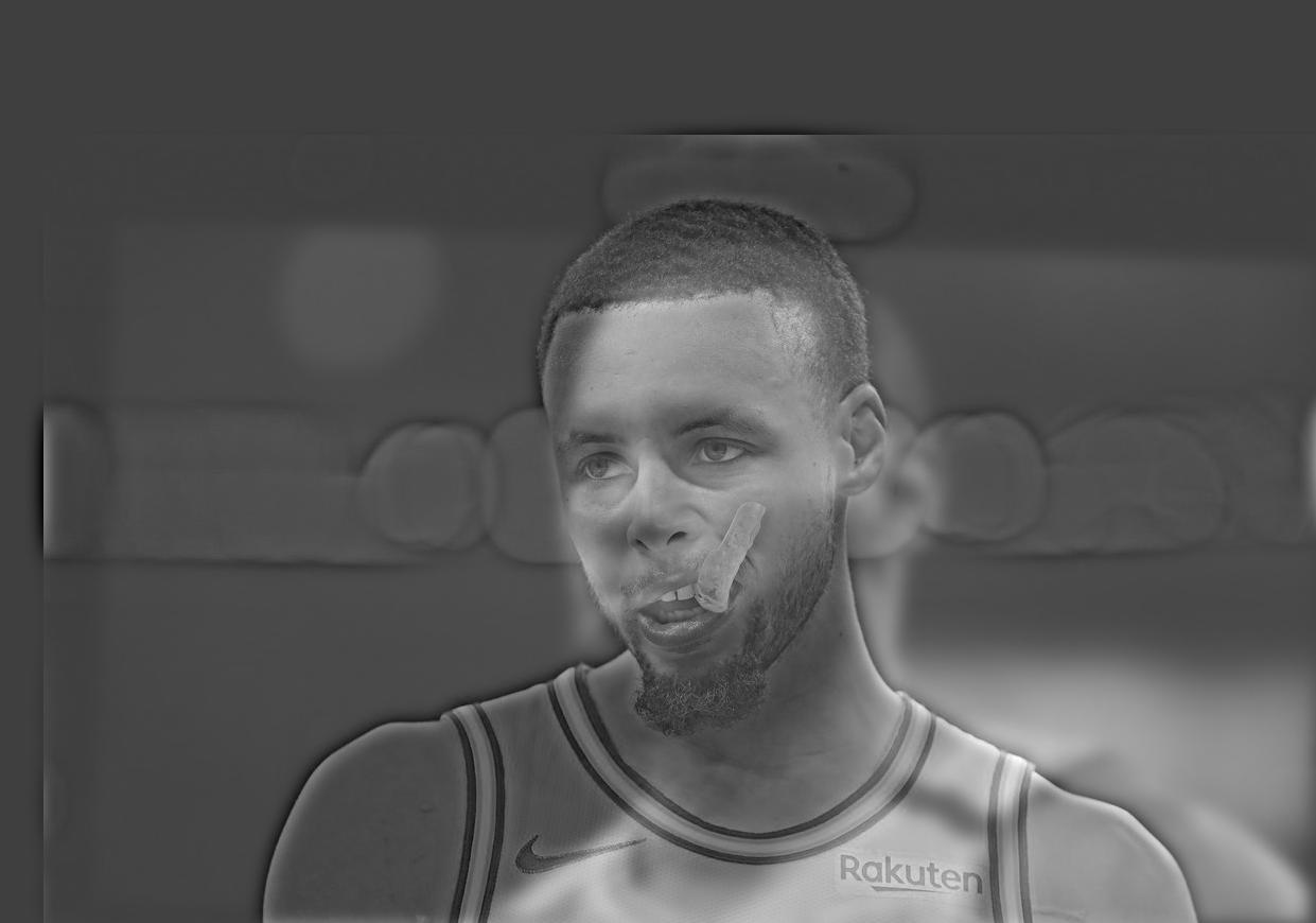
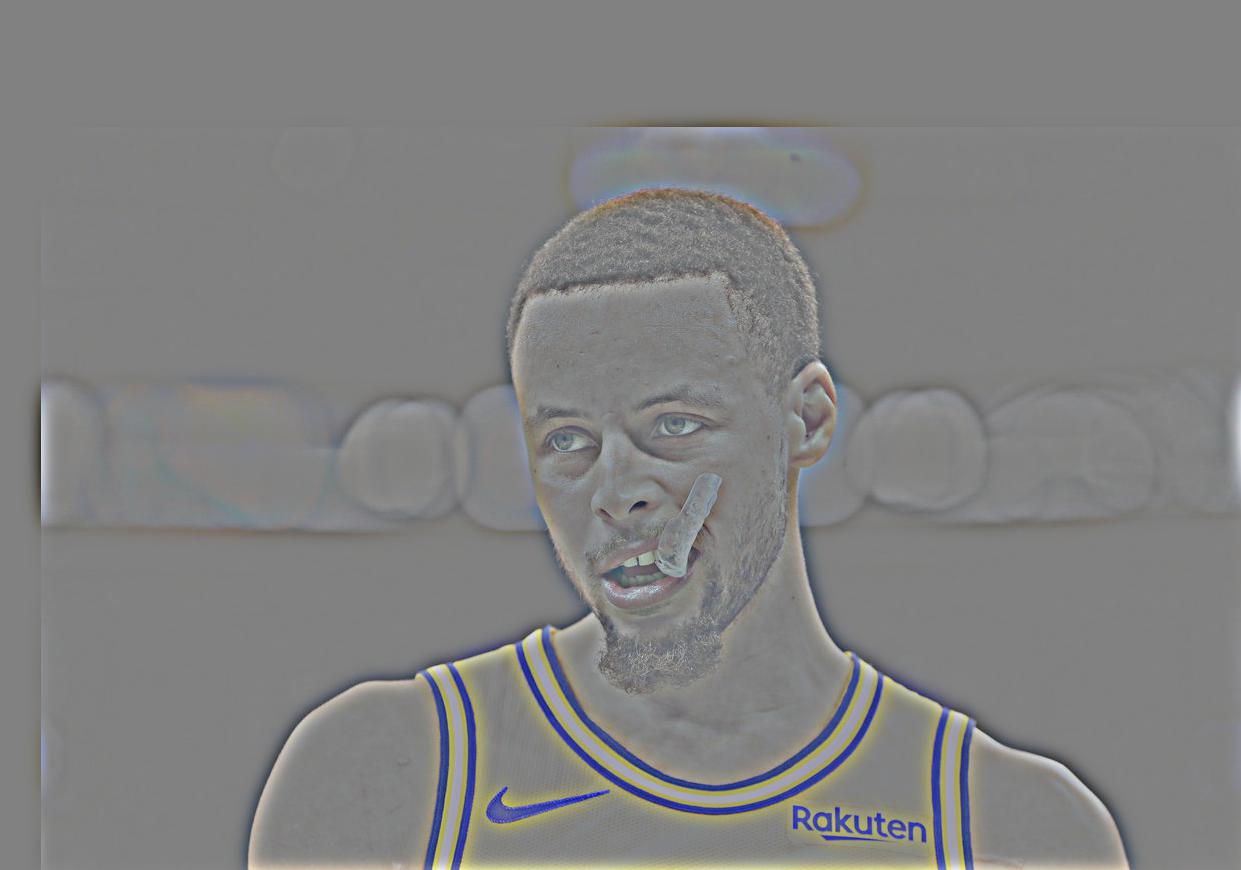
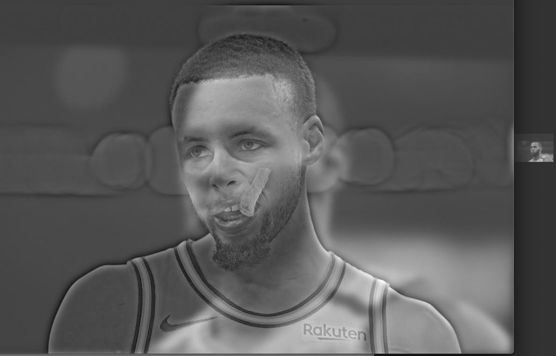
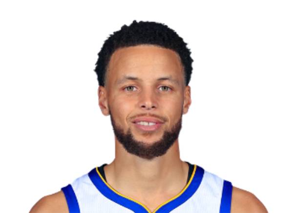
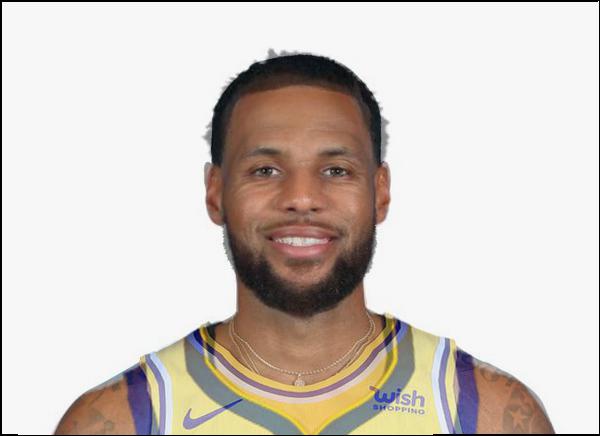
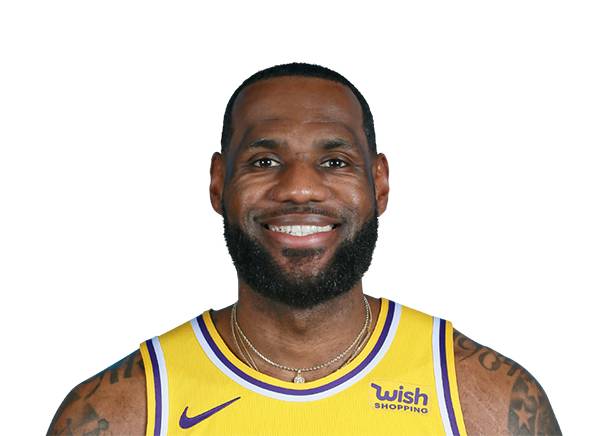
Hybrid Steph / Lebron
I averaged the low-pass and high-pass results of the 2 images to create the hybrid images.

Hybrid Hemoa
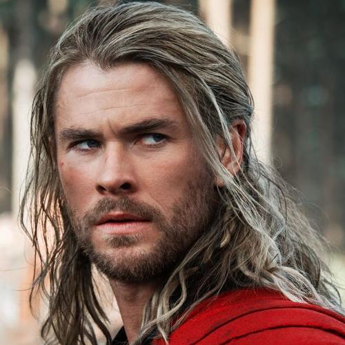
Hybrid Chris Hemsworth and Jason Momoa

Hybrid Dowl
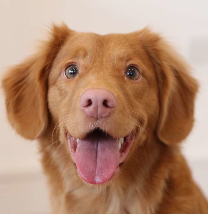
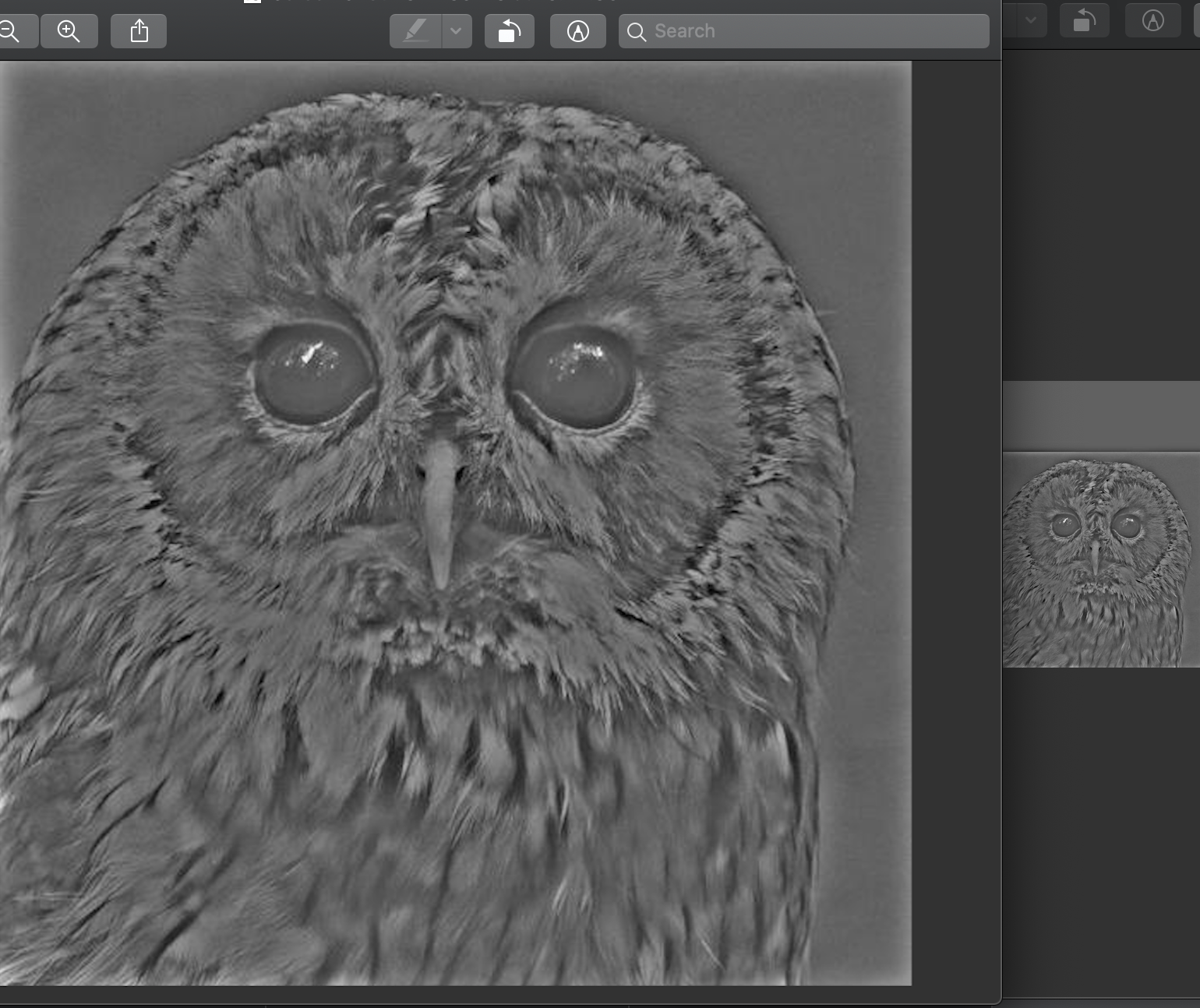
Hybrid Dog and Owl. Another good example of a hybrid image.

Hybrid Dowl
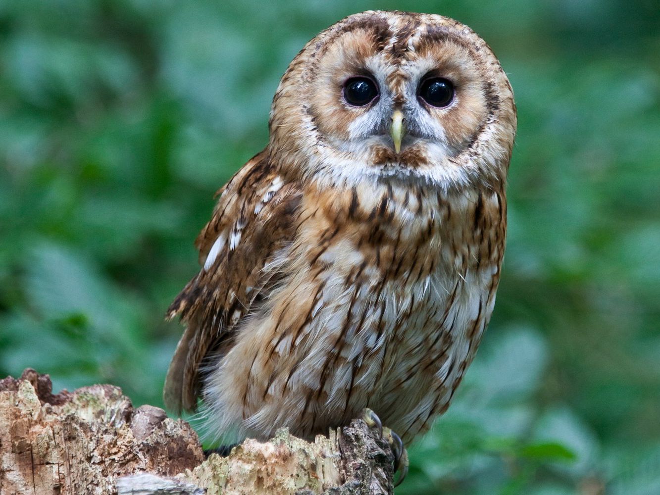
Hybrid Owl and Dog. In this case, the owl and dog were switched, so the one that was low-pass-filtered is now high-pas-filtered and vice versa. This is a bad example.
Multi resolution blendings
The following algorithm was used to create the laplacian pyramid and blend 2 images:
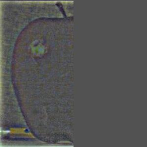
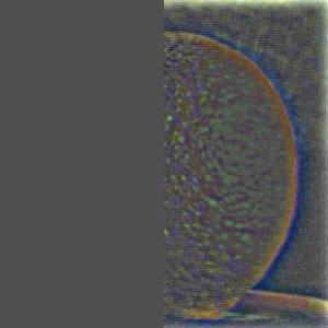
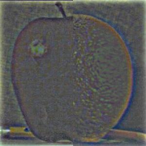
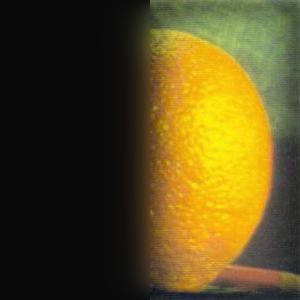
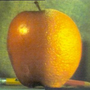
And here are the results for the oraple = orange + apple
Highest frequency (level 0)
Middle frequency (level 3)
Lowest frequency (level 5)
Final multi-resolution blended image
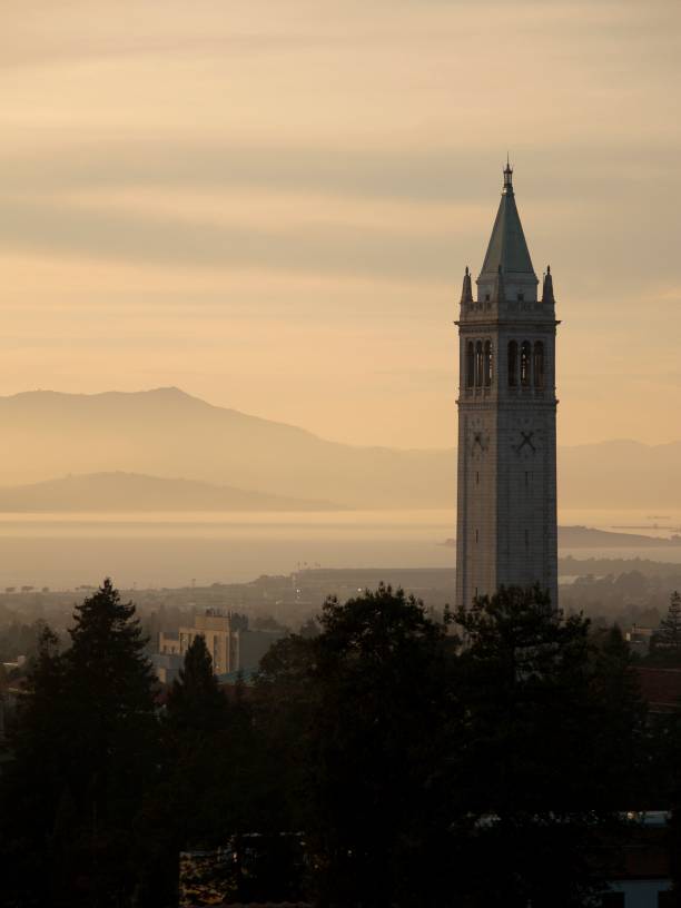
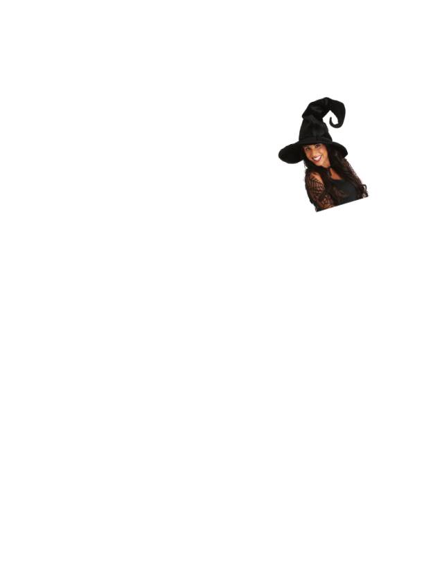
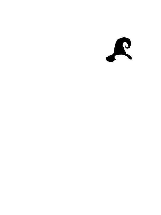
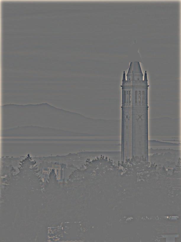
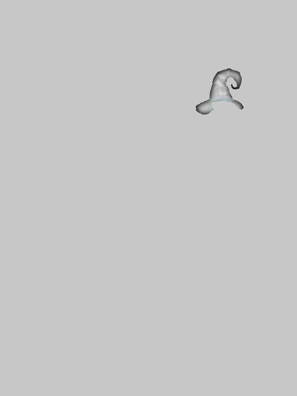
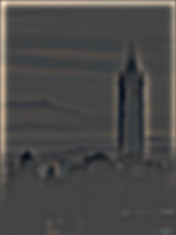
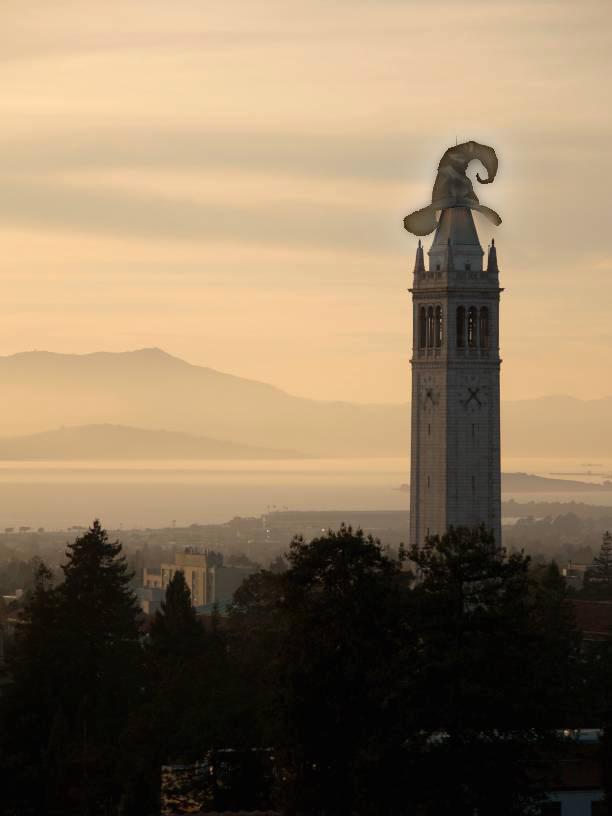
Multi resolution blending of hat on campanile
Initial Images
Highest frequency (level 0)

Middle frequency (level 3)
Lowest frequency (level 5)
Final multi-resolution blended image
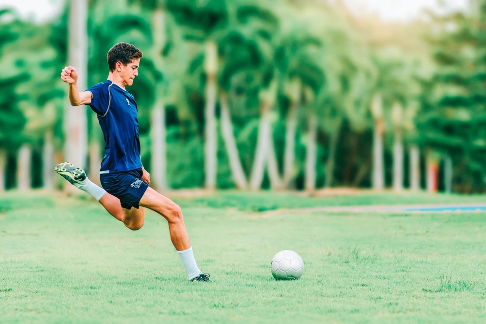
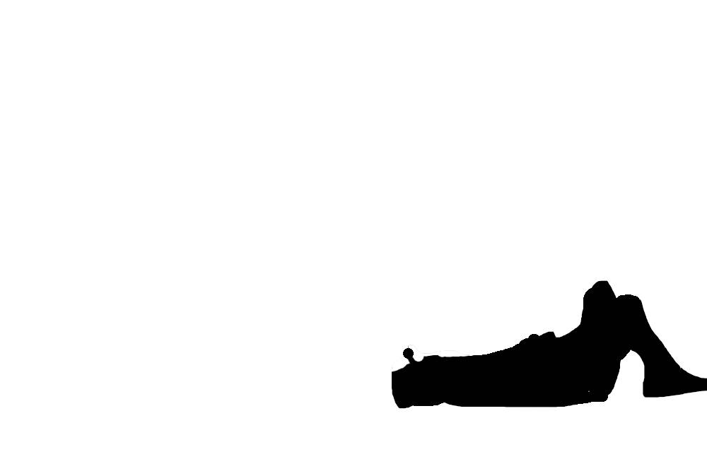
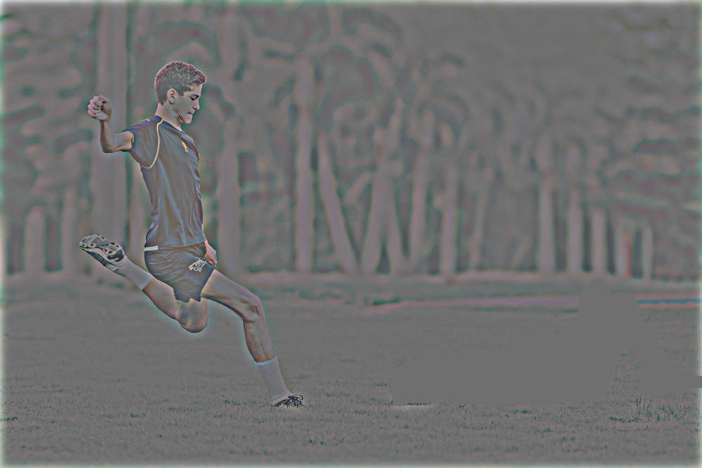
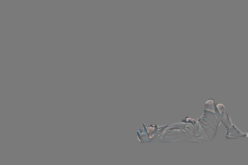
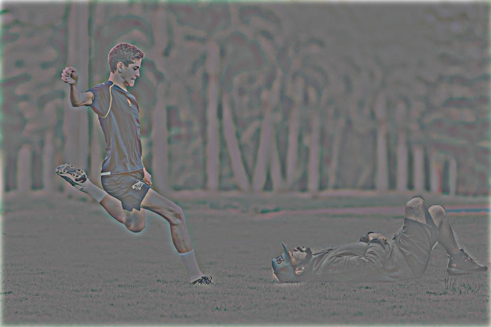
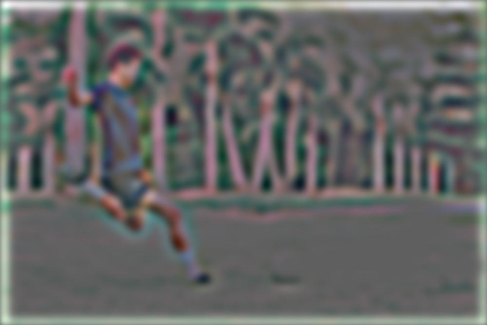
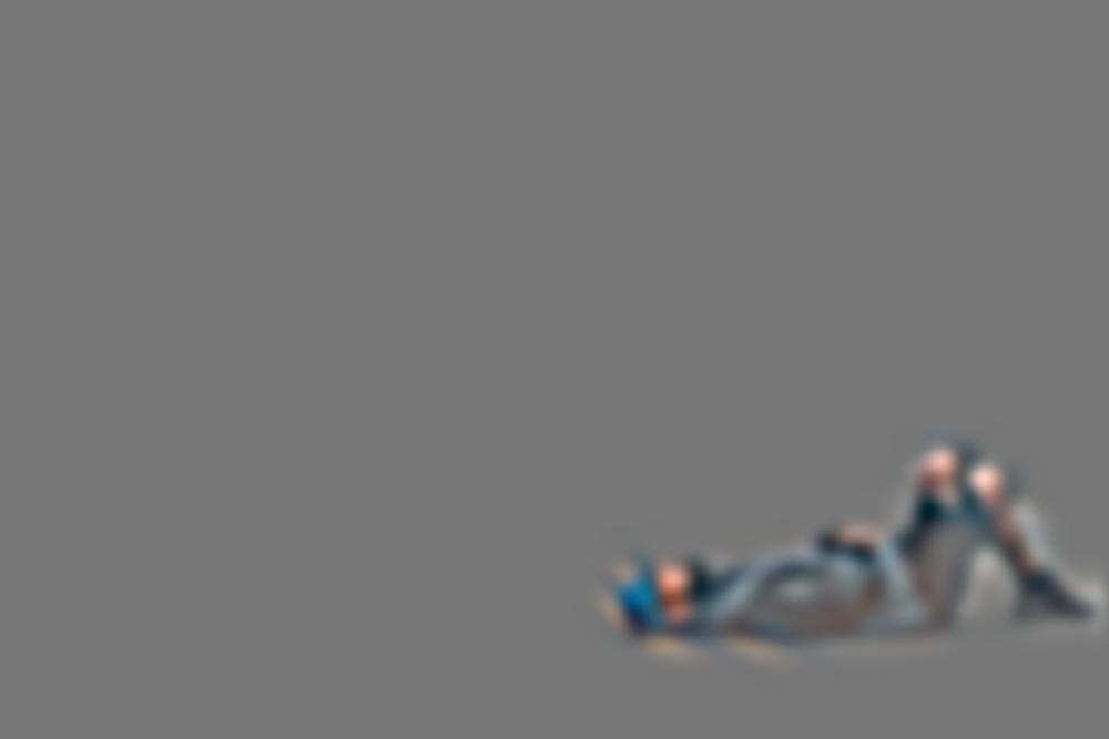
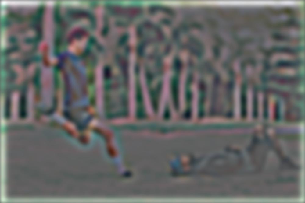
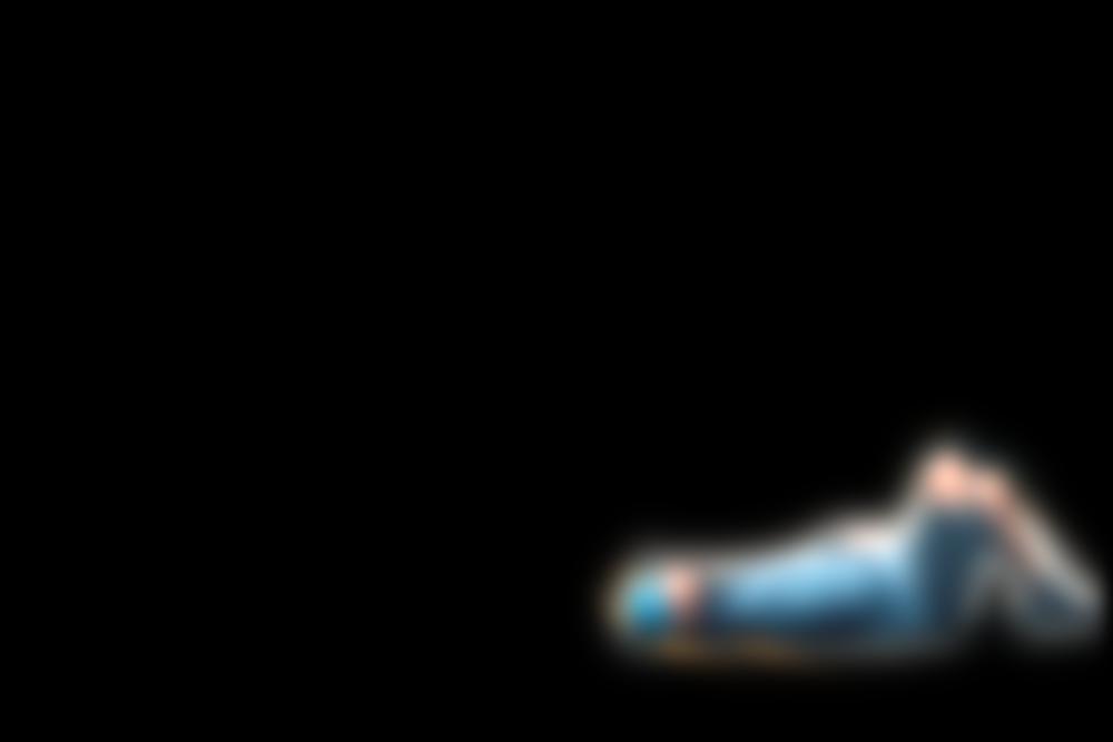
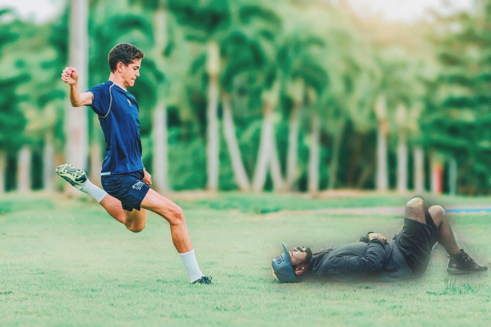
Multi resolution blending of soccer player kicking sleeping man
Initial Images

Highest frequency (level 0)
Middle frequency (level 3)
Lowest frequency (level 5)
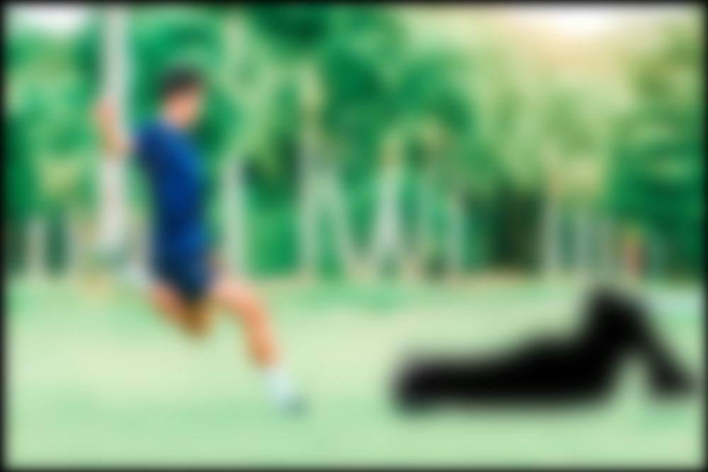
Final multi-resolution blended image
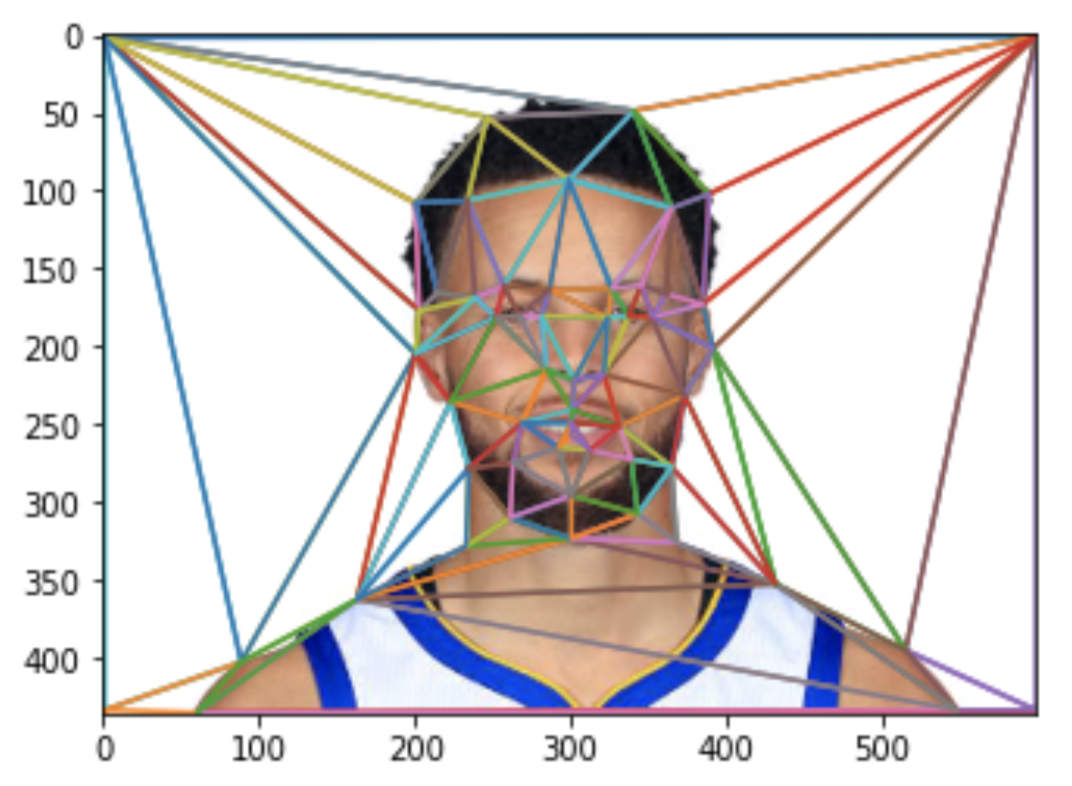
Step 1. Defining Correspondences
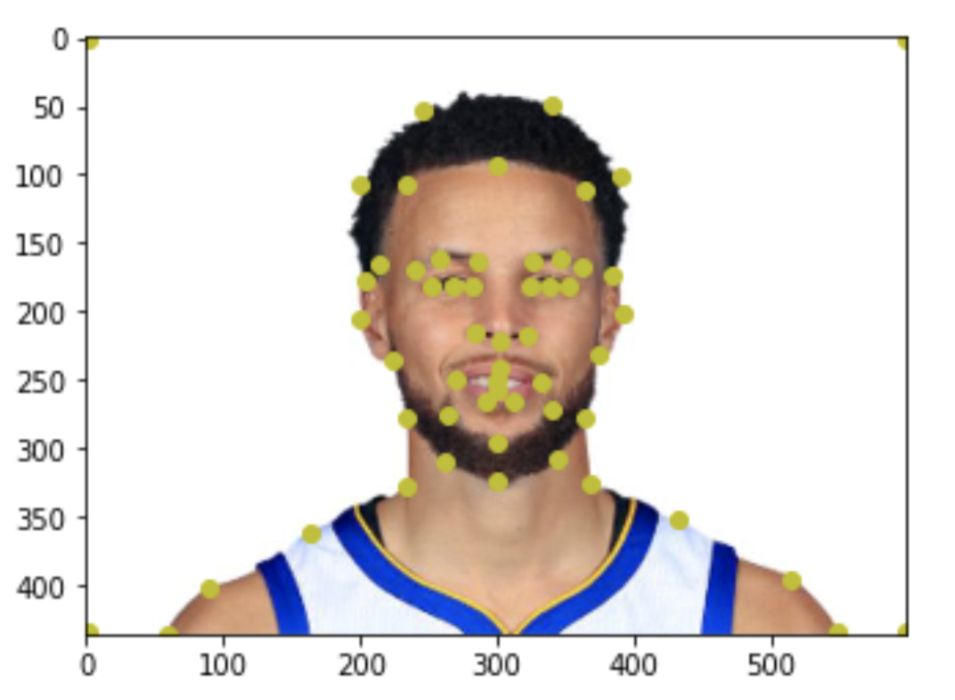
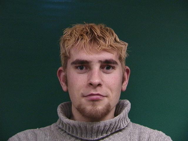
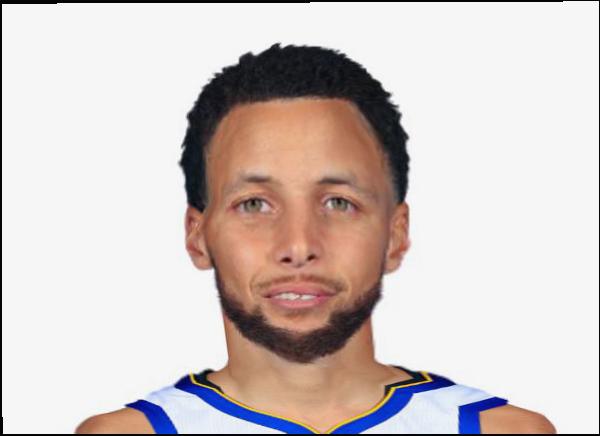
To define correspondences, I selected 56 points (including 4 corners) on each face image. These points represent features that are matched between 2 images. This picture shows the 56 points on an image of Steph Curry.
To calculate a triangulation, I used Delauney triangulation, as shown in this image.
Part 2: Midway Face
I followed these steps to create the midway face: 1. Compute the “average shape” by averaging the key point locations of the 2 images. 2. Warp both faces into that average shape 3. Given the 2 warped images, average the colors together to get a morphed image. To warp 2 faces, I had to find an affine transformation to warp each triangle in one image, to the corresponding triangle in the other. Affine transformations have 6 variables, so 3 sets of (x,y) coordinates is enough to solve the system. Once we know how to warp one triangle into its corresponding shape, we just have to loop over all triangles, and warp them all to match the new shape.
Instead of doing this forward warping, however, I did inverse warping. Forward warping creates holes in the result image because not every point needs to be hit, like if a small triangle gets mapped to a much larger one. So instead of warping the source image’s triangles to the destination, I warped the destination’s triangles to the source.
Part 3: The Morph Sequence
For the average image, the features of the 2 images were averaged. To create a gif animation, however, we need a gradually changing set of features. I used 45 frames, so my features were gradually changed from image 1’s features to image 2’s features.
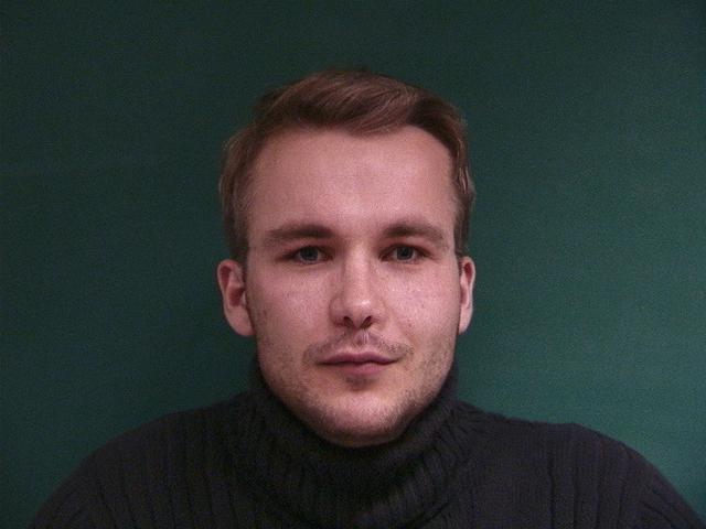
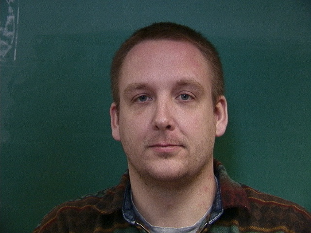
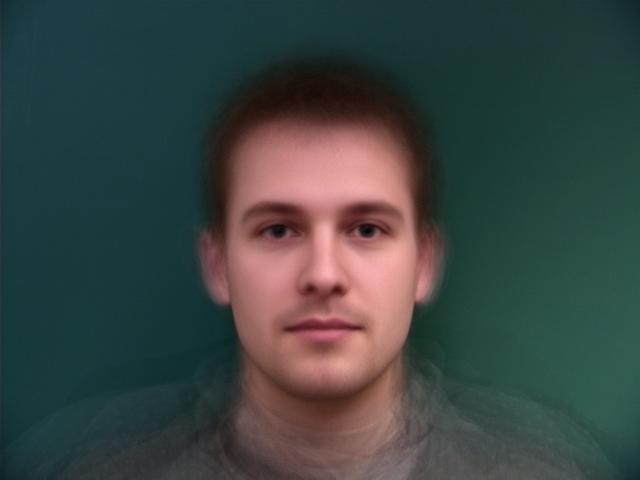
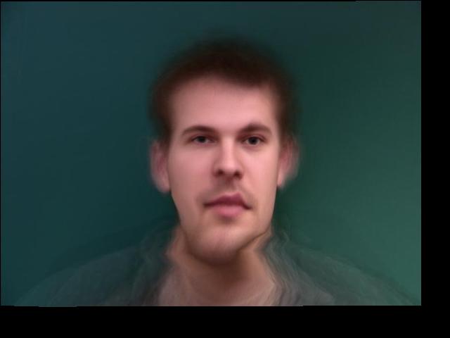
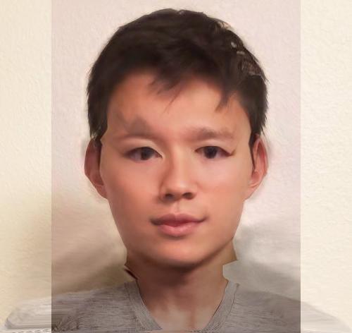
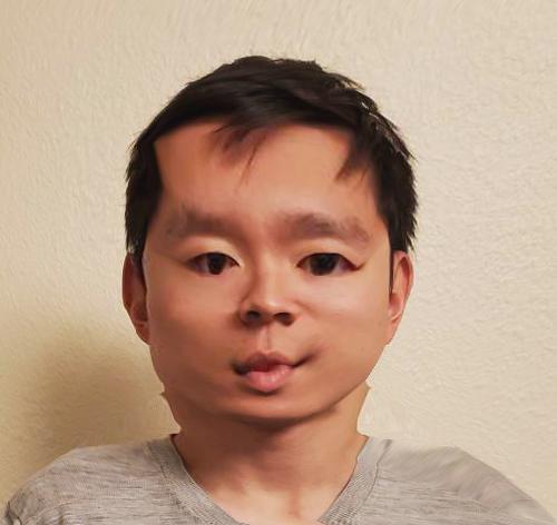
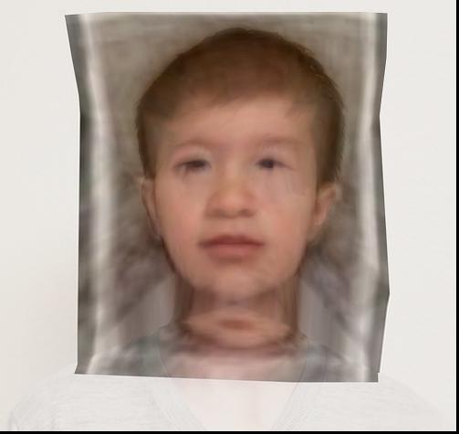
The “Mean Face” of a Population
I used the Danes dataset found here: https://web.archive.org/web/20210305094647/http://www2.imm.dtu.dk/~aam/datasets/datasets.html It includes pre-selected key points, so I didn’t need to manually select points for each of the images. For my project, I only used image type 1, which is a full frontal face with a neutral expression. I also only used the male subpopulation because I thought a male/female midway mix could have weird translucent hair. 1. The average face shape was calculated by averaging the key points across all the images. 2. Each face was then morphed into the average shape.
here are some results of morphing a few Danes into the shape of the average Dane. The numbers I use are from the original numbering used in the dataset.
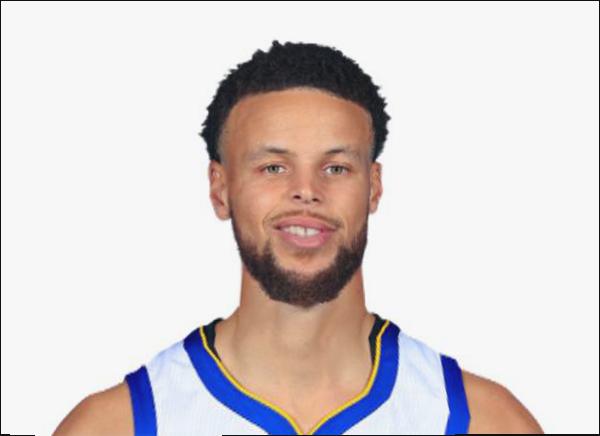
3. To compute the average face, I just averaged all the pixel values at each point. The results show a very smooth, symmetric face as shown here. Here are some results of Steph Curry morphed into the shape of an average Danish male: And here is the average Dane morphed into Steph Curry’s shape:
Caricatures
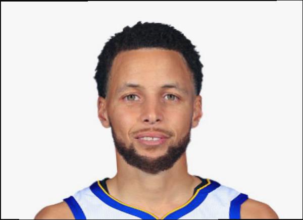
Caricatures are just images of people with overly exaggerated features. To make Steph Curry extra Danish, instead of doing a midway morph with the average Dane, we can take Steph’s features, and add a scaled vector of the difference between steph and the average dane New features = steph_features + alpha*(dane_features - steph_features) A positive alpha makes Steph look more Danish, and a negative alpha makes him look less Danish. Resulting images can be seen here:
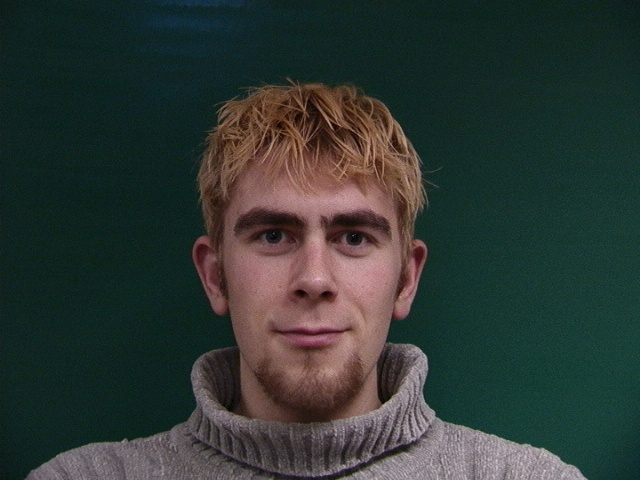
Bells and Whistles 1
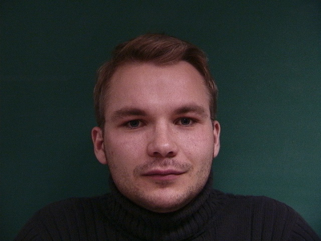
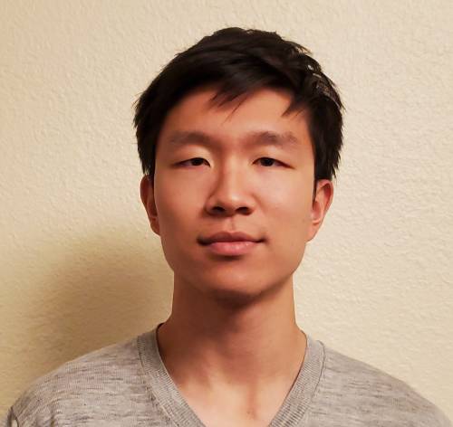
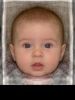
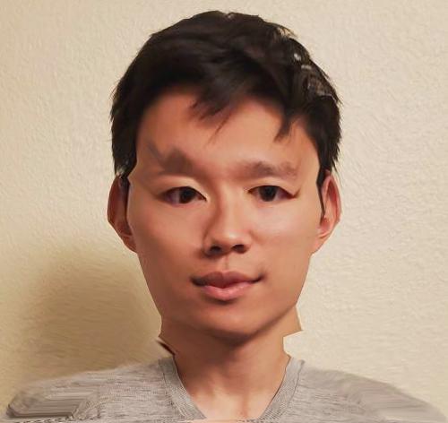
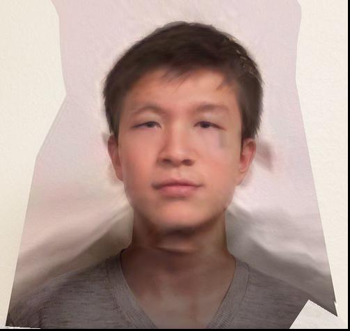
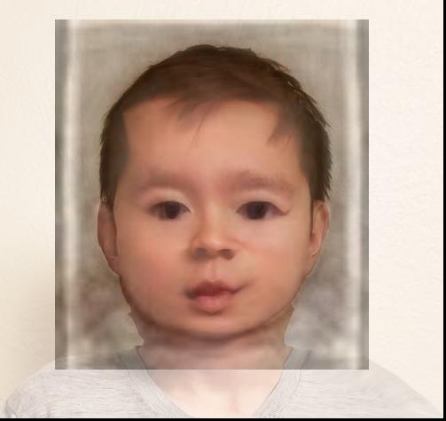
I changed the age of my friend, using an average 10 year old male picture found online (source: http://faceresearch.org/demos/images/thumbs/avg_res/age/10_male), and separately using an average baby (source: http://faceresearch.org/demos/images/thumbs/avg_res/age/baby).

Bells and Whistles 2
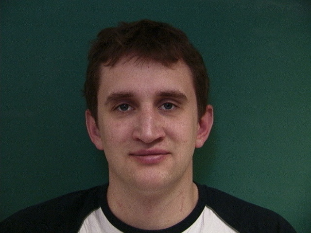
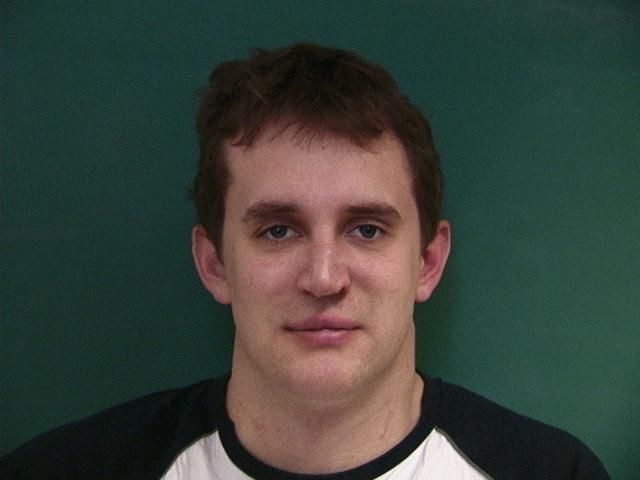
Chain of morphs with my friends. For this part, I asked my friends for pictures of themselves, and morphed one person to the next. The results vary. Going from someone with long hair to someone with short hair looks a little strange, and differences in background also take away from the morph. My favorite transition was between my 2 roommates, whose pictures had the same background, and they both have short hair. The result is extremeley smooth and honestly each of the middle frames could be an actual person.
Project 5: Facial Keypoint Detection with Neural Networks
Nose Tip Detection
For this part, we use PyTorch and a simple CNN to train a model to detect the tip of the nose on faces. We are not predicting the entire set of 58 keypoints, but rather just 1 (x,y) keypoint for the tip of the nose.
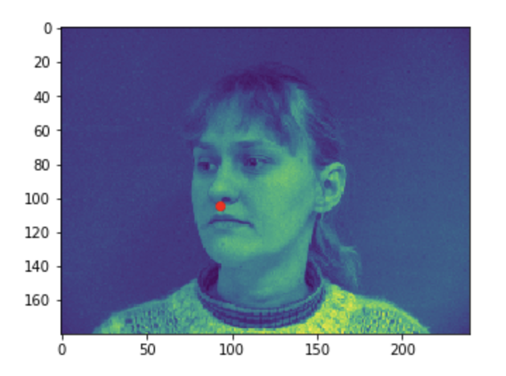
Visualizing the given keypoint on the tip of the nose
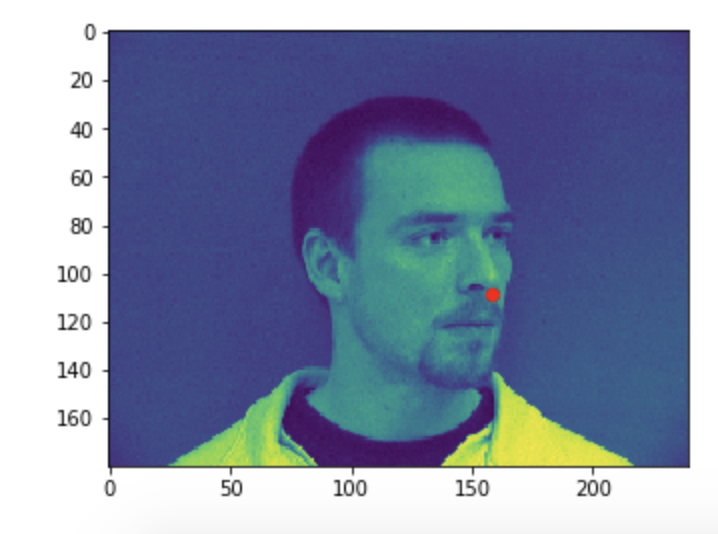
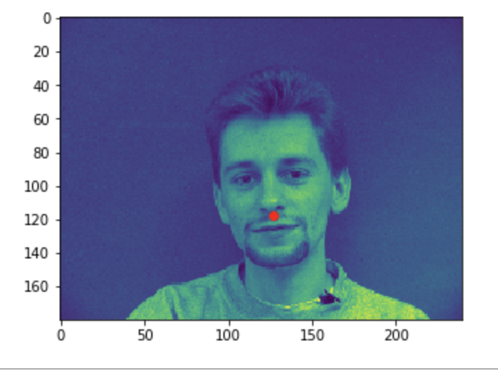
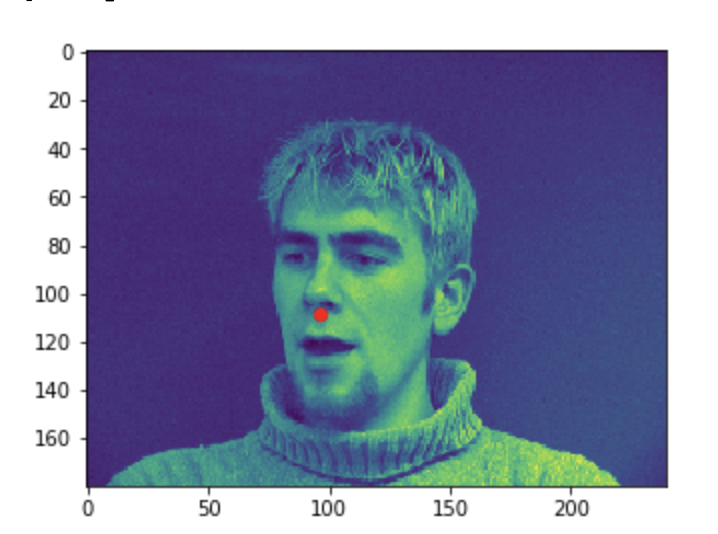
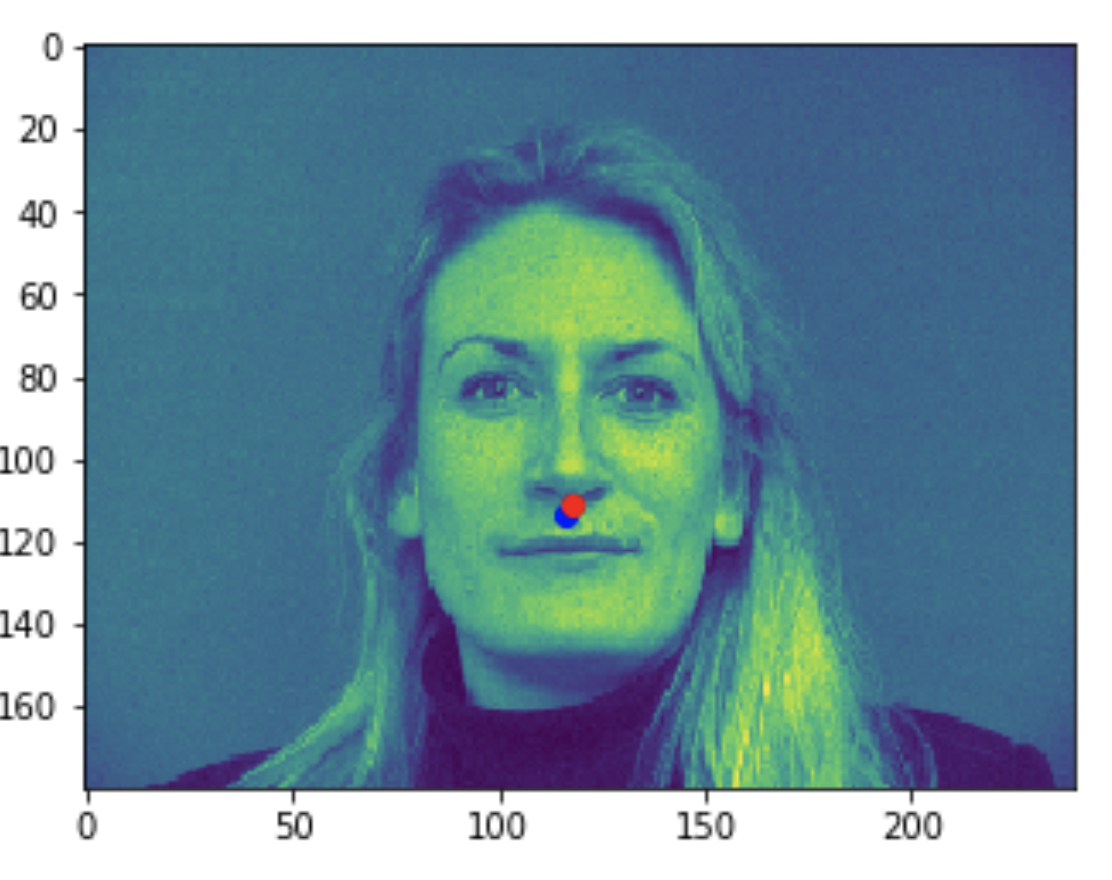
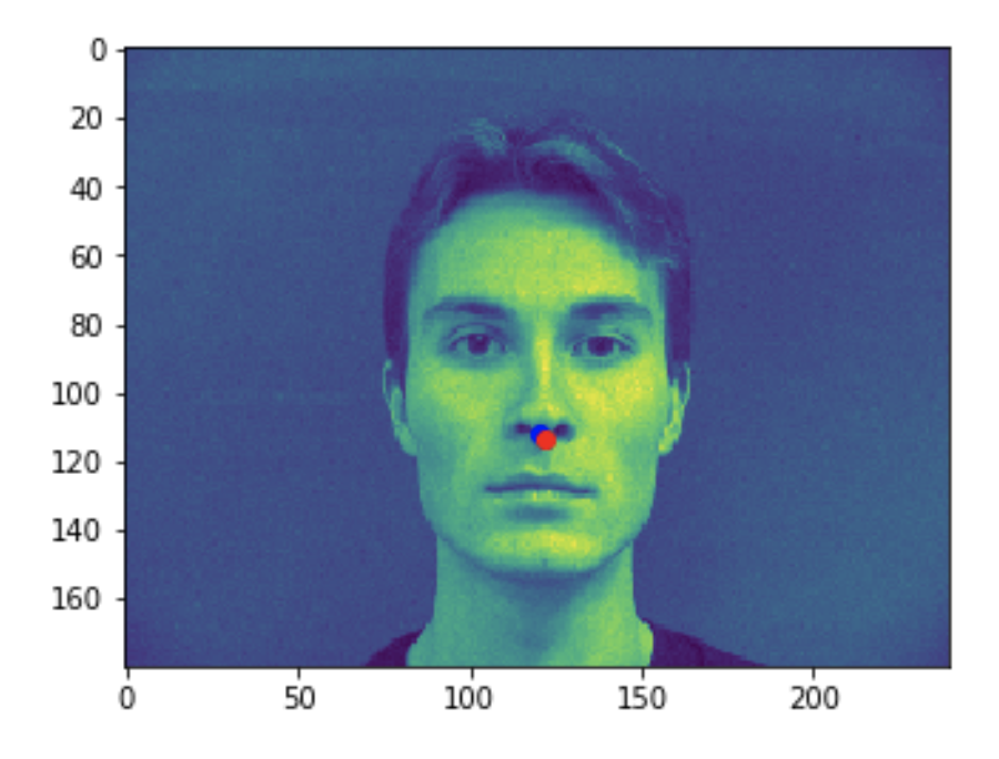
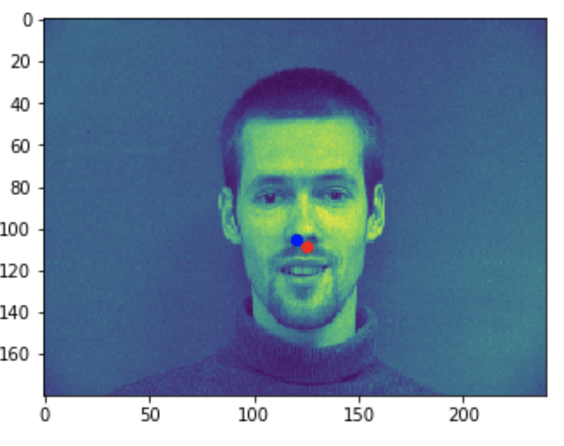
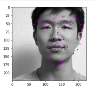
Some good predictions made on the testing set. The red marker is the true keypoint, and blue is the predicted keypoint
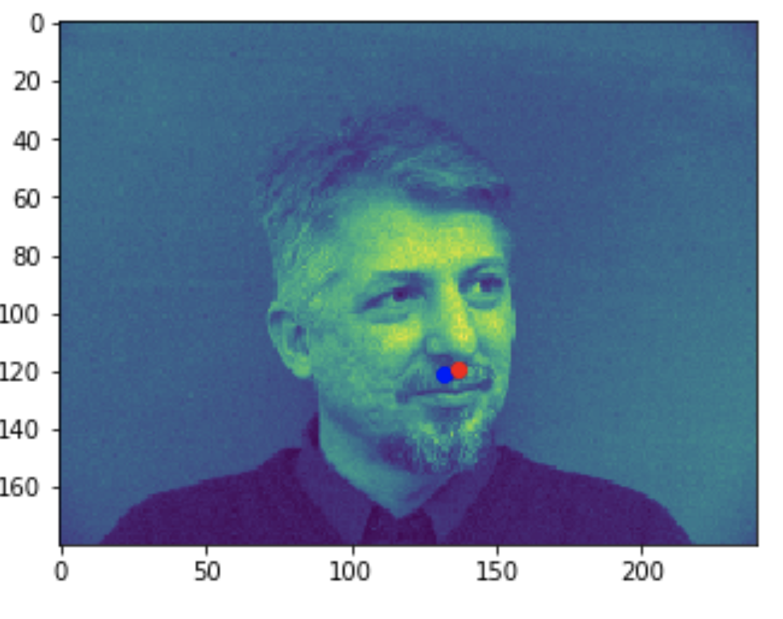
Some bad predictions made on the testing set. Again, red is the true keypoint and blue is predicted
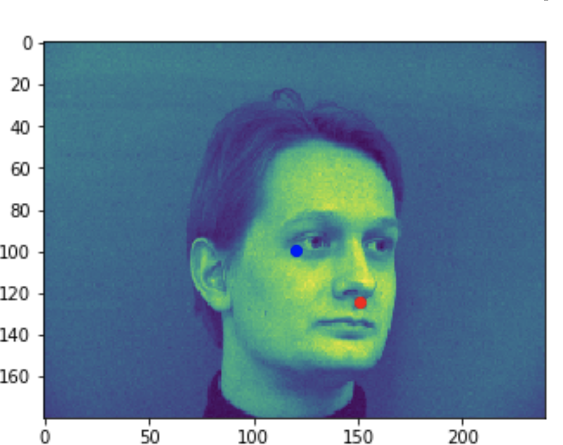
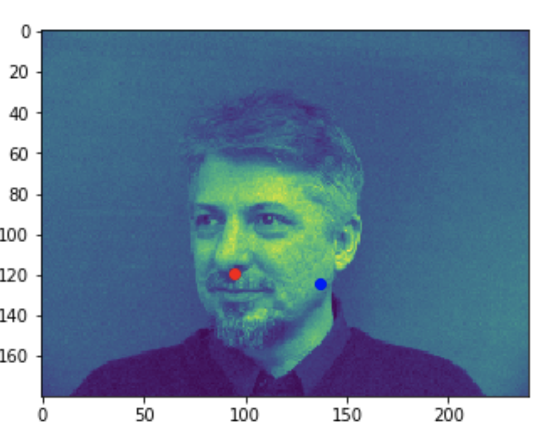
In all the bad images, the faces were tilted to the side, so that may have confused the model, making it perform worse. The predictions in these cases were near the middle of the photo, around where the nose would have been if the person was looking straight ahead.
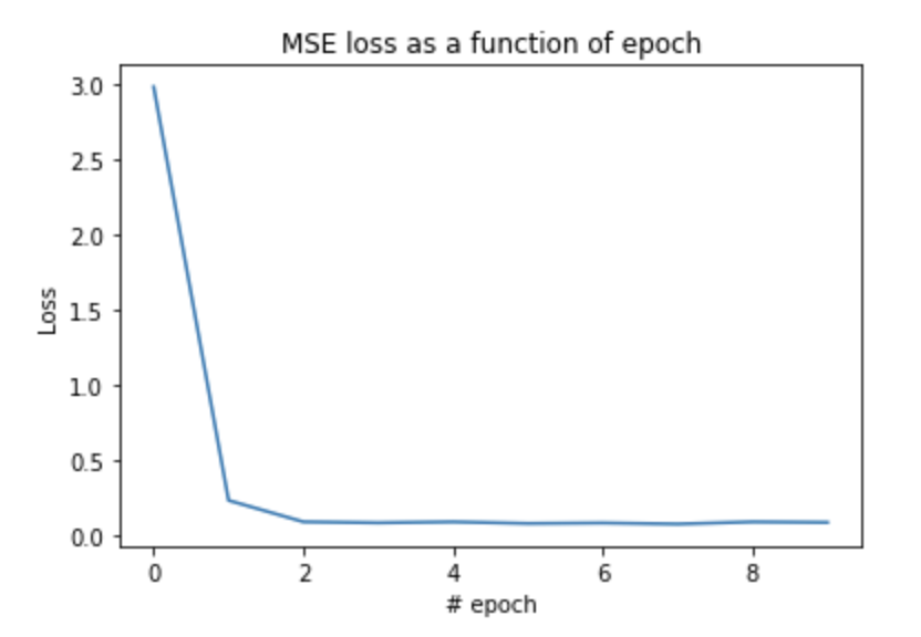
And here is the training loss seen. It quickly decreases, and then settles at around 0.01
A lower batch size did a lot worse, getting results as seen below. These predictions are very off, even on faces that are looking straight ahead. TODO: ADD PICS SHOWING THE BAD RESULTS
Full Facial Keypoints Detection
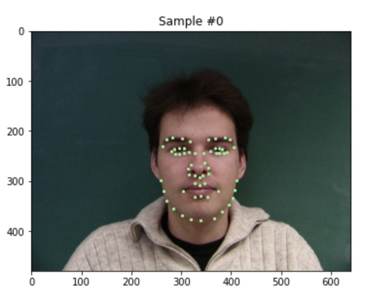
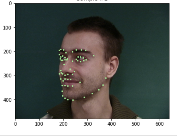
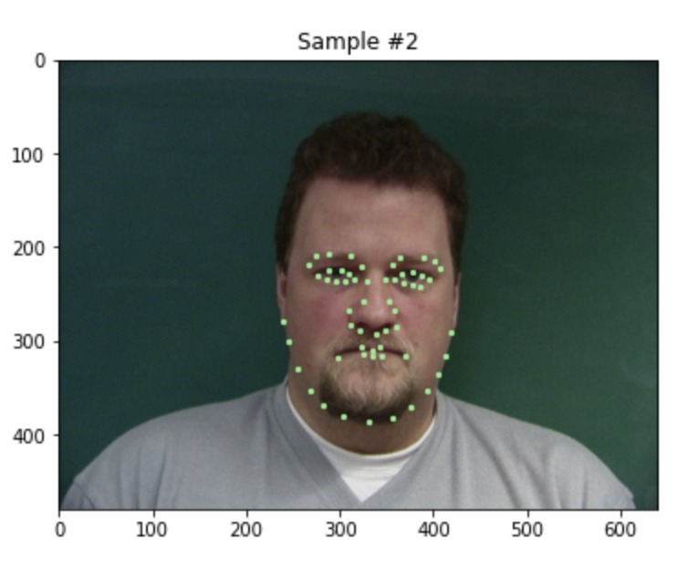
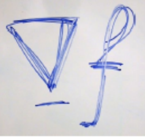
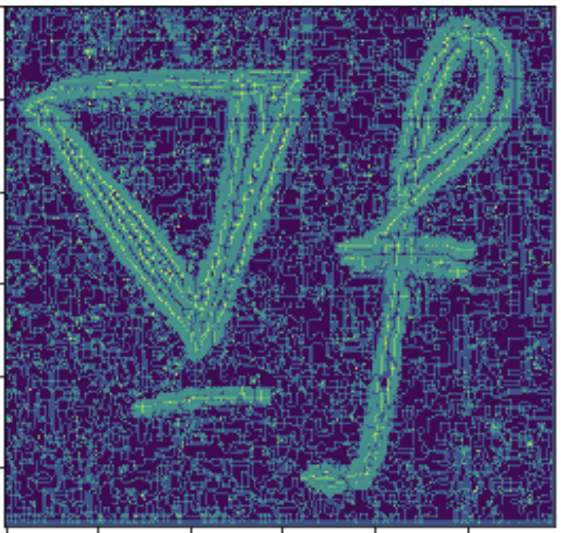
First, we look at some visualizations of correctly loading in the data, and viewing all 58 keypoints.
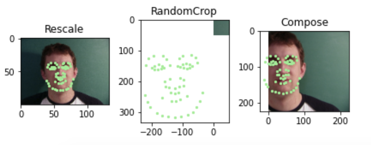
Even with data augmentation, such as scaling, random cropping and translating, we can visualize all the keypoints.
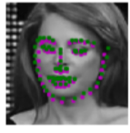
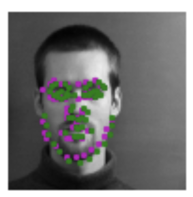
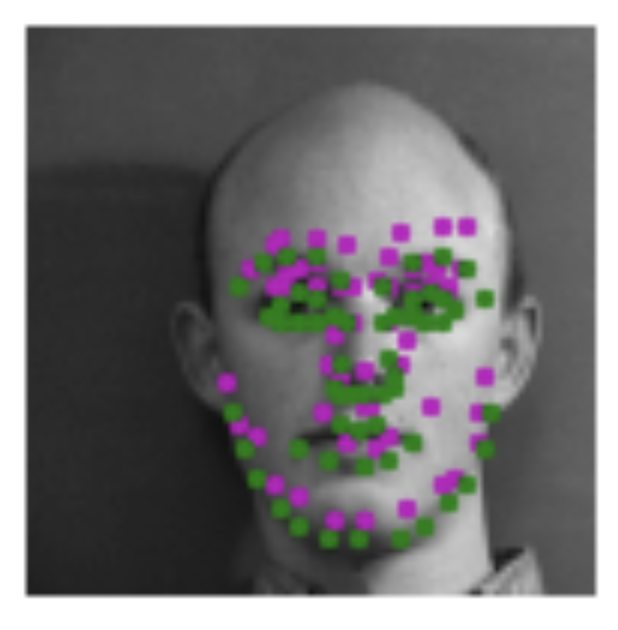
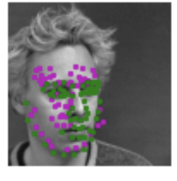
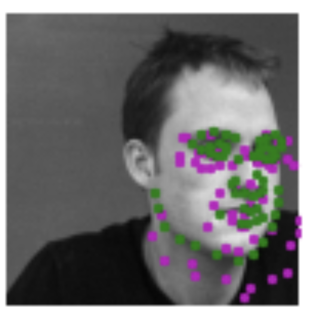
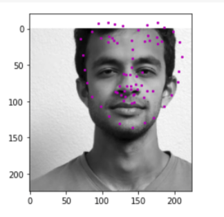
The green dots are the true keypoints, and purple are the predicted keypoints.The first 2 are pretty good predictions, while the next 2 are pretty bad. Both the bad ones are faces that are looking off to the side, and the model doesn't seem to be able to predict the keypoints very well.
          Model Architecture

  Layer 1: 1x32x5x5 Conv ->  ReLU -> 2x2 MaxPool -> Dropout
  Layer 2: 32x64x3x3 Conv -> ReLU -> 2x2 MaxPool -> Dropout
  Layer 3: 64x128x3x3 Conv -> ReLU -> 2x2 MaxPool -> Dropout
  Layer 4: 128x256x3x3 Conv -> ReLU -> 2x2 MaxPool -> Dropout
  Layer 5: 32x32x3x3 Conv -> ReLU -> 2x2 MaxPool -> Dropout
  Layer 6: 36864x1000 Linear -> ReLU -> Dropout
  Layer 7: 1000x1000 Linear -> ReLU -> Dropout
  Layer 8: 1000x58*2 Linear
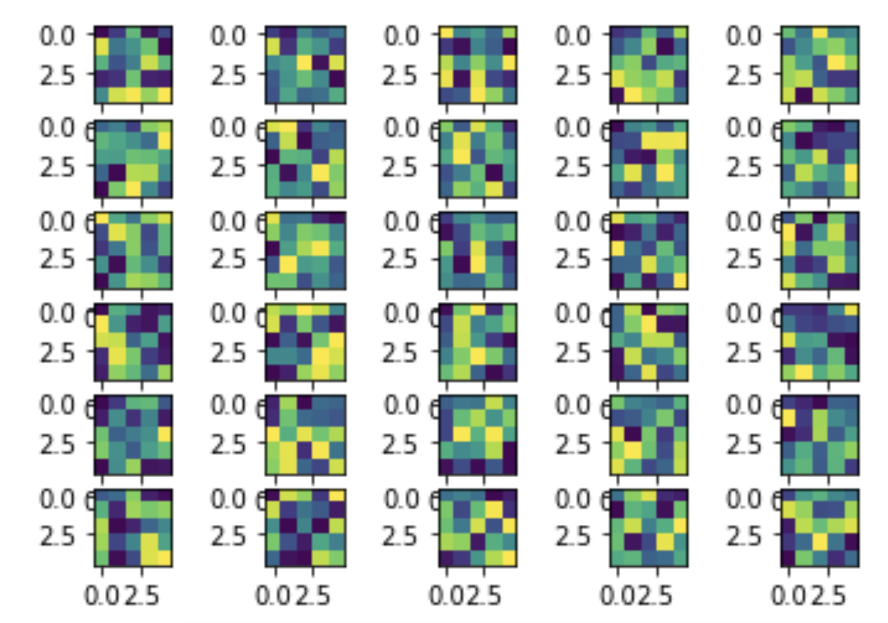
And here are the learned filters for the first layer, visualized:
Part 3: Train with Larger Dataset
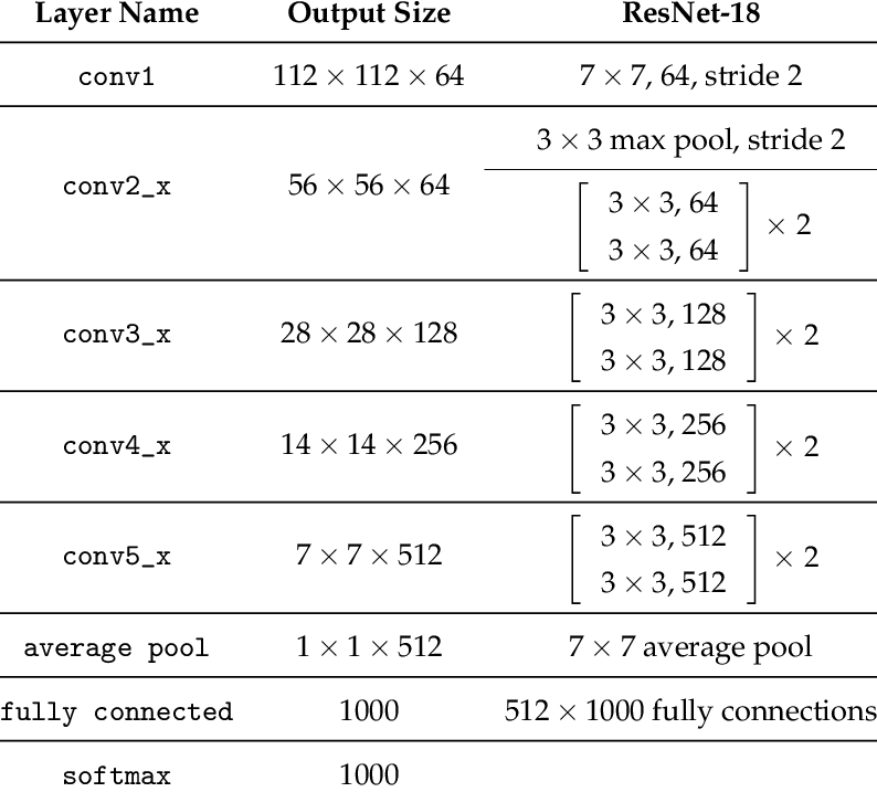
In this section, we train a resnet18 model using a large dataset containing 6666 images. I submitted my predictions to kaggle. The architecture was the classic resnet18 architecture, with the first conv layer changed to have an input_channel =1 because the images are grayscale rather than color. Additionally, the last linear layer was set to have an output channel of size 68*2 = 136 because we want to predict 68 (x,y) keypoint coordinates. THe image below shows the classic architecture of resnet18 before the aboev modifications were made. (Source: https://www.researchgate.net/figure/ResNet-18-Architecture_tbl1_322476121)
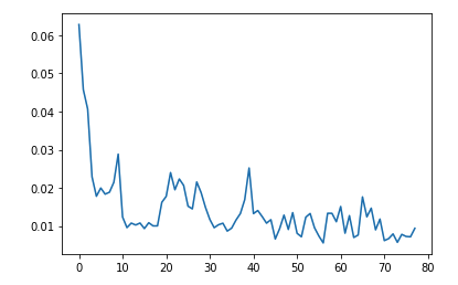
This was the loss of my model, 10 times per eopch, with 8 epochs.
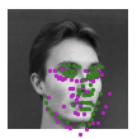
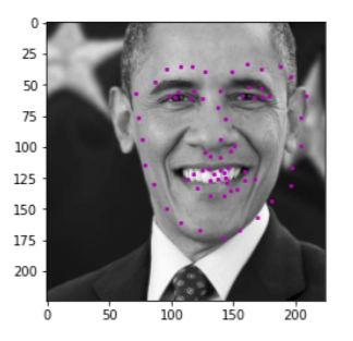
here are some results of testing my model on my own dataset (pictures of my friends, and Obama). The results are very mixed. They are decent, but not great at all as seen in the middle picture, where even the eyes aren't properly detected.
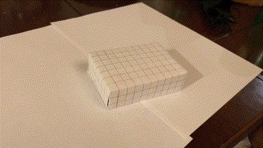
1: Augmented Reality
Source video
This is the video I took of a marked box, with known 3D coordinates for each intersectio of lines (every line is spaced by 1cm).
Tracking corners
I used a hacky harris corner detector. Starting with the first frame, which has known image coordinates for each 3d coordinate, I looked the next frame. In the next frame, the corner is the closest corner found to the previous frame's known corner, given it is within 15 pixels in euclidean distance. This is because there is little movement between frames, so the same corner should appear in a very similar position in the next frame. Now we see a video of tracking these points over the course of the entire video. (I didnt use all intersections on the box because I didn't need so many. Since the next frame relies on the previous frame's known coordinats, if we lose sight of an intersection in one frame, then it can never come back in the future. However, since we have so many keypoints, we have enough to do least squares and find the camera projection matrix to convert from real coords to image coords.)
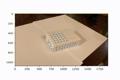
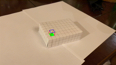
Image Projection
Now that we have many keypoints with known real_world --> image coordinates, we can use least squares to solve for the projection matrix of each frame. We can then use this matrix to project new real_world coords into our image frame. Here, we project a cube onto our image. As the video progresses and the camera moves around, the AR box correctly follows the image world coordinates.
2: Gradient Domain Fusion
With gradient domain fusion, we can blend 2 images without any strange, high frequency seams between the two. This is done by matching the derivative inside a source image (one that is pasted into a destination image).Instead of matching the pixel colors of the source image, it matches the derivative. This means the color may change from green to red, but the overall appearance of the image will be the same. The destination image is kept as-is (except for the part that is pasted on top of.)
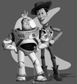
Part 1: Toy Problem
As a simple example of least squares, we start by taking an image from Toy Story, and creating a new image that has as similar a gradient (in both x and y) as possible. We set up the Ax=b least squares problem, where x is our recovered image. A is of size (2*width*height + 1, height*width). Each row represents a constraint. The first width*height rows represent the x-gradient constraint for every pixel. The next width*height rows represent the y-gradient constraint for every pixel. Finally, to ensure the image looks similar, the last row sets the top left corner of the image to be the same value as the original image. Similarly, b is of size (2*width*height + 1, 1). It is created by taking the dot product of A and the toy image. Like in A, the first width*height entries represent the x-gradient, the next width*height entries are the y-gradient, and the last entry is the top left pixel value, all from the image of the toy. Now, when we solve for b, we ensure all gradients are the same, and the top left pixel is the same. The result is extremeley similar to the original image.

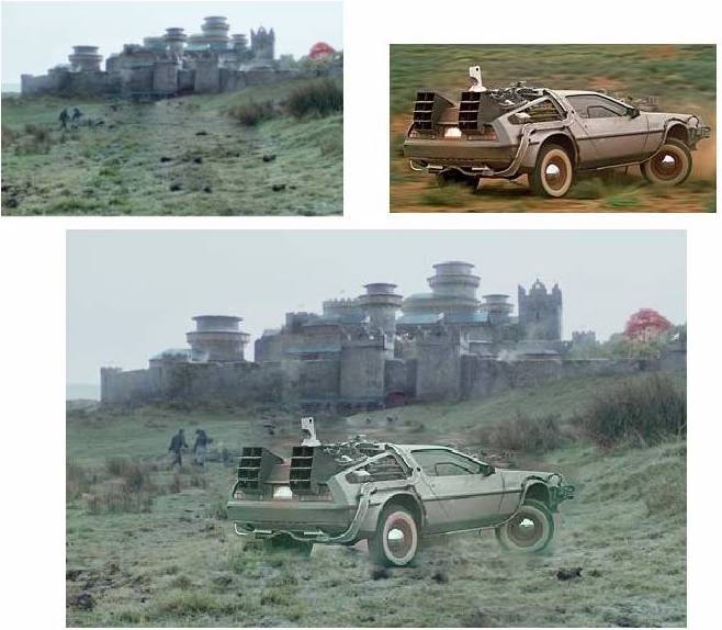
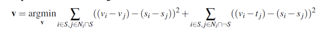
Part 2: Poisson Blending
We now use a very similar technique to solve the following problem, where v is the result image, and s is the source image. We solve this separately for each channel, and then stack them together to create a final image.
And here are some results.

Now we look at a couple bad results. The outputs are decent, but the difference in the 2 images was too high, resulting in a clear blurry outline of the image.
2: Bells and Whistles
I tried doing the mixed gradient part of Gradient Domain Fusion. I was able to correctly create the new b vector, which contains the sum of highest gradients in x and y, from the source or target. I have shown the source and target images used, as well as the mixed gradient vector found. However, when solving with least squares like in the previous part, I am not able to recreate an image that places the text onto the texture of the wall. I used the same A that worked in previous parts, and b as described above, but using least squares to solve for x in A*x = b did not return a meaningful result.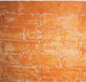
In part A, I picked correspondences manually. In part B, I used the harris corner detector to automatically find correspondences
4a: Image Warping and Mosaicing
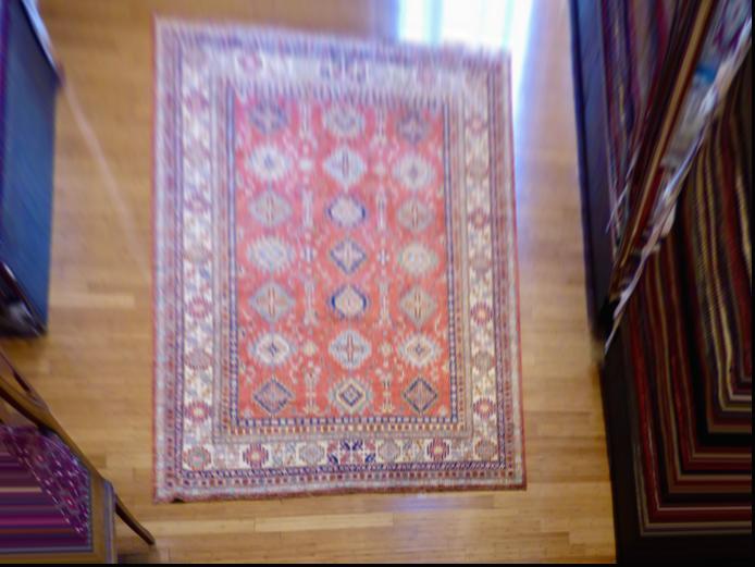
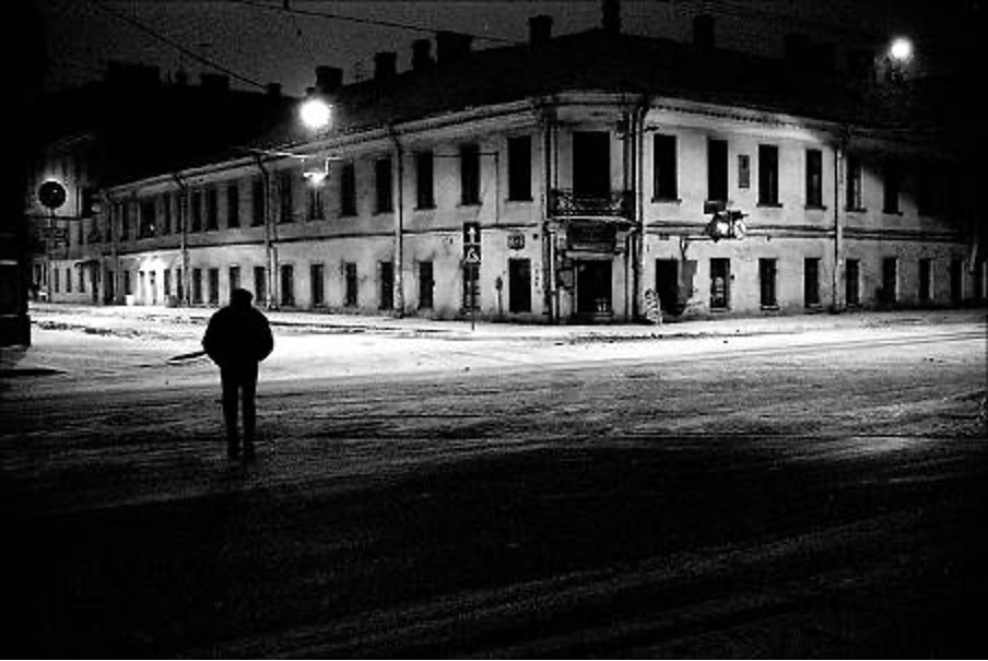
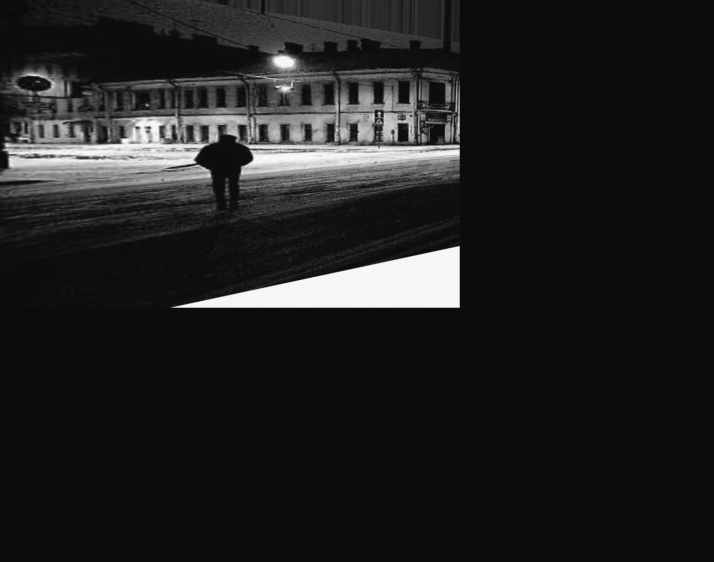
Image Rectification
I used inverse warping to get the warped image, so the H matrix takes points from the final warped shape coordinates to the old unwarped shape coordinates.
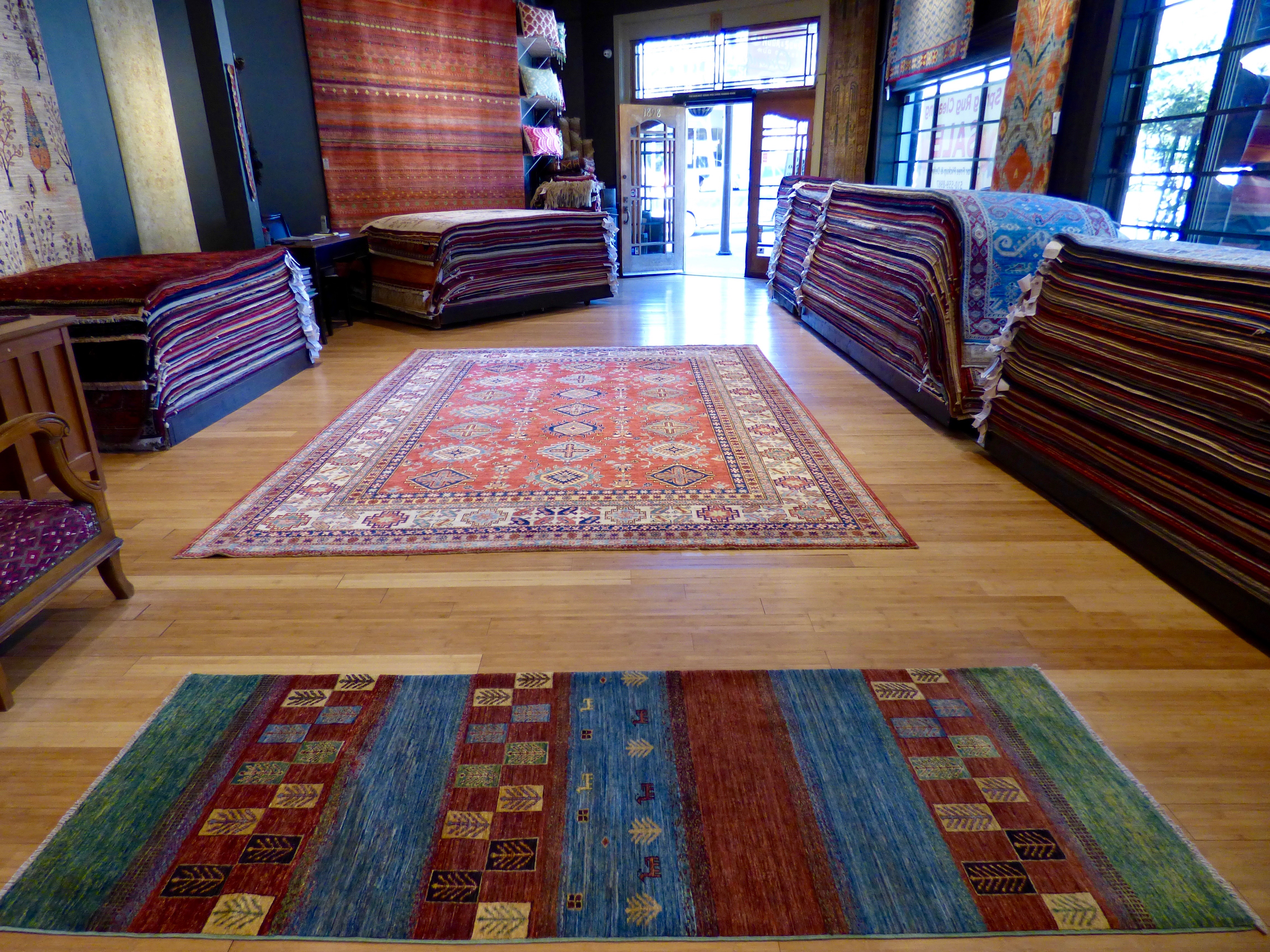
To test my warping, I used a carpet (similar to the example seen in lecture), and warped it into a top-down view where the pattern is much more visible. I also did the night street example shown in the slides.
Bluring images into Mosaics
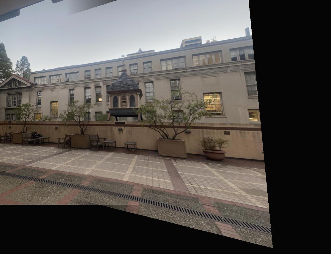
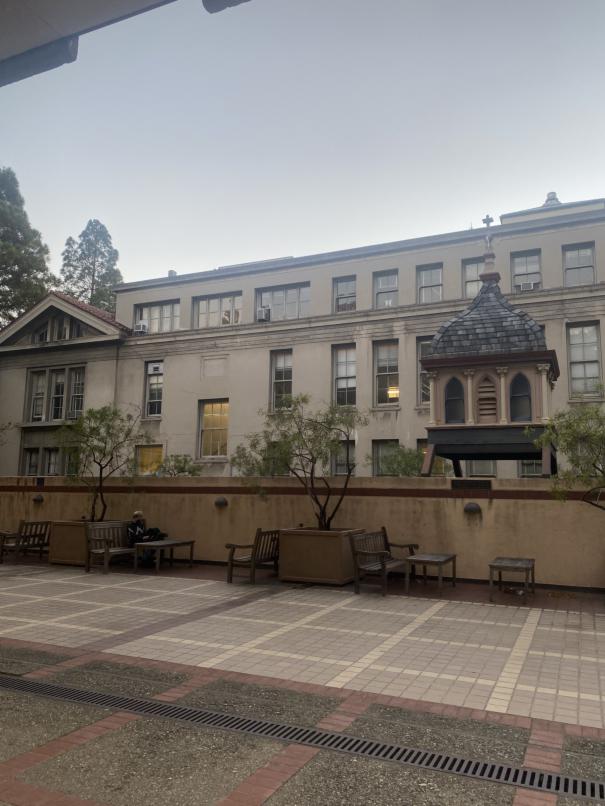
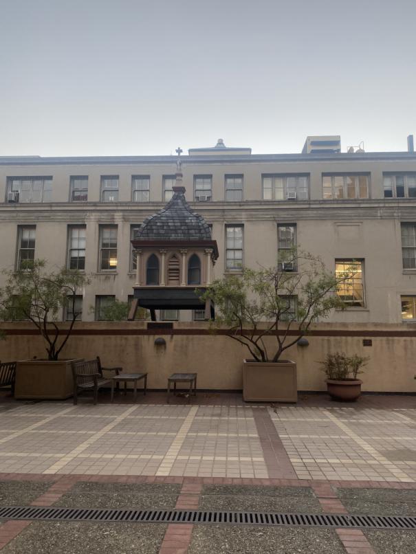
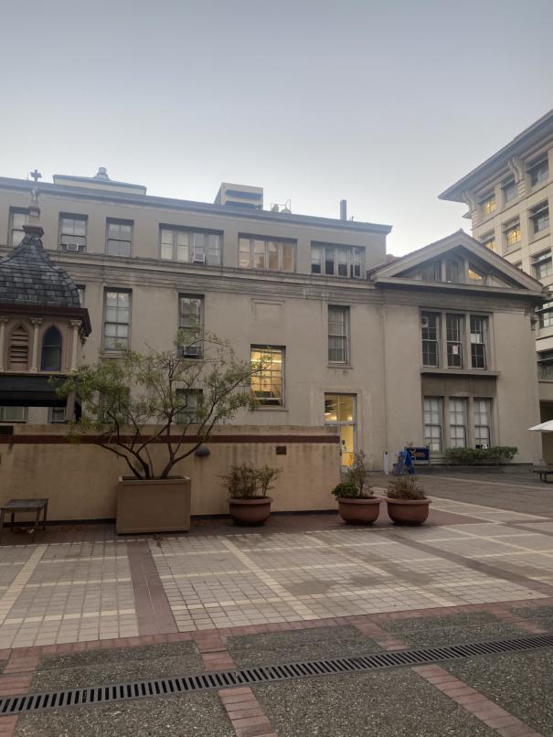
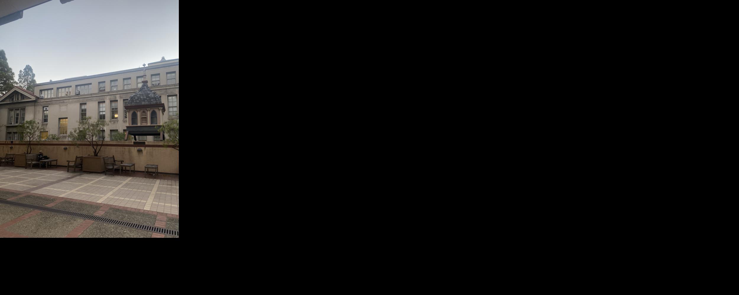
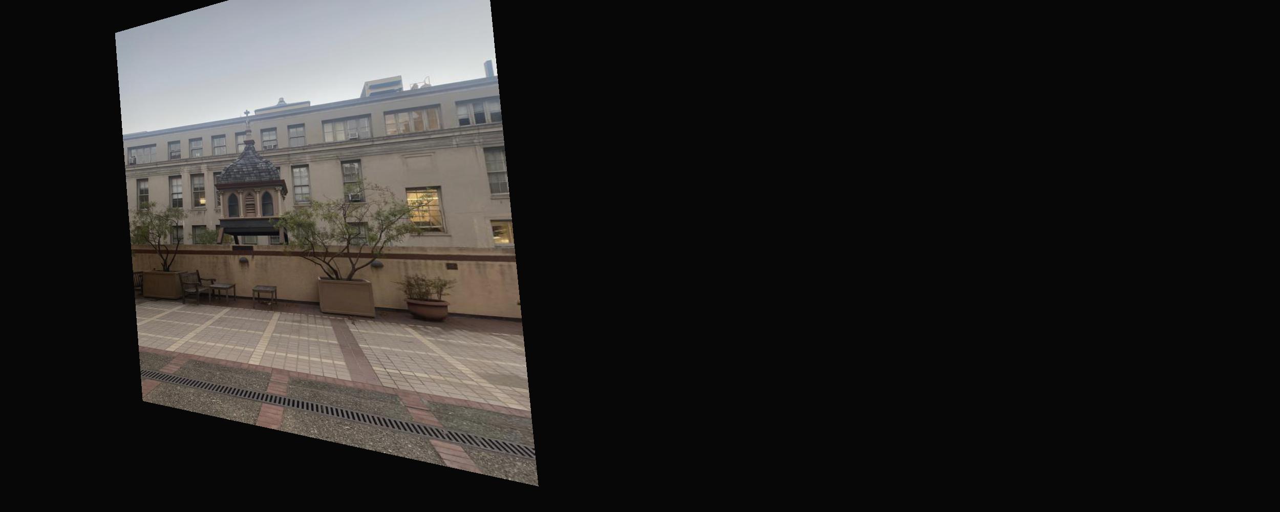
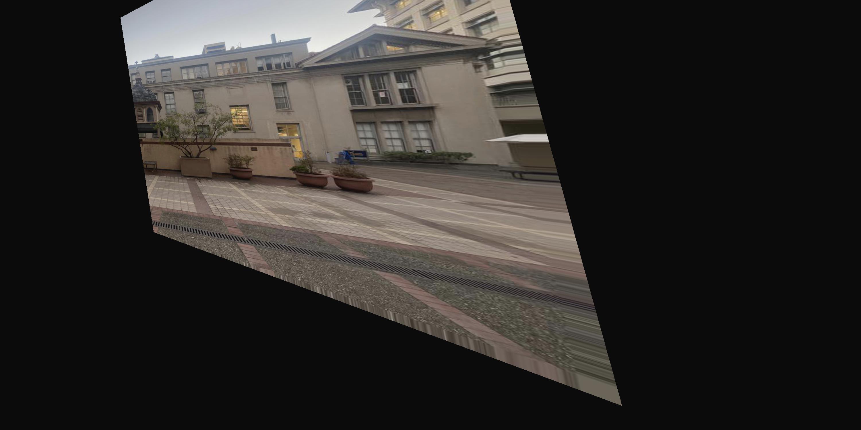
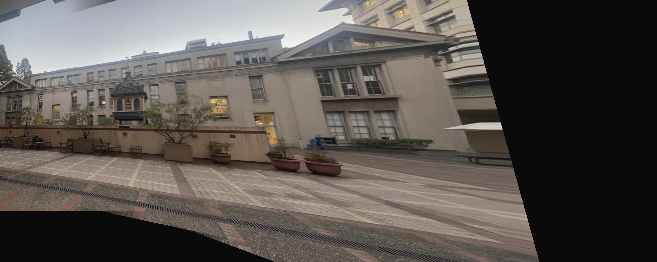
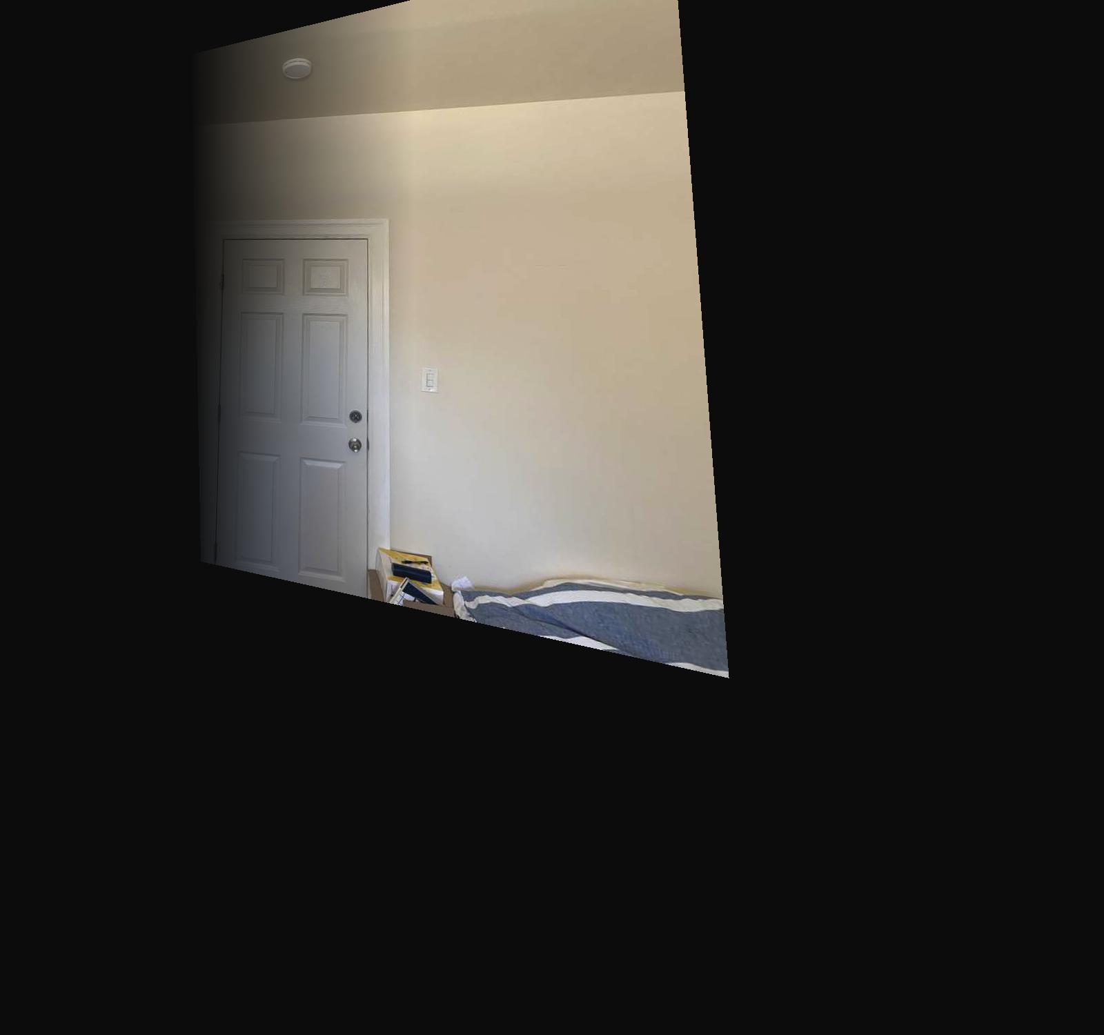
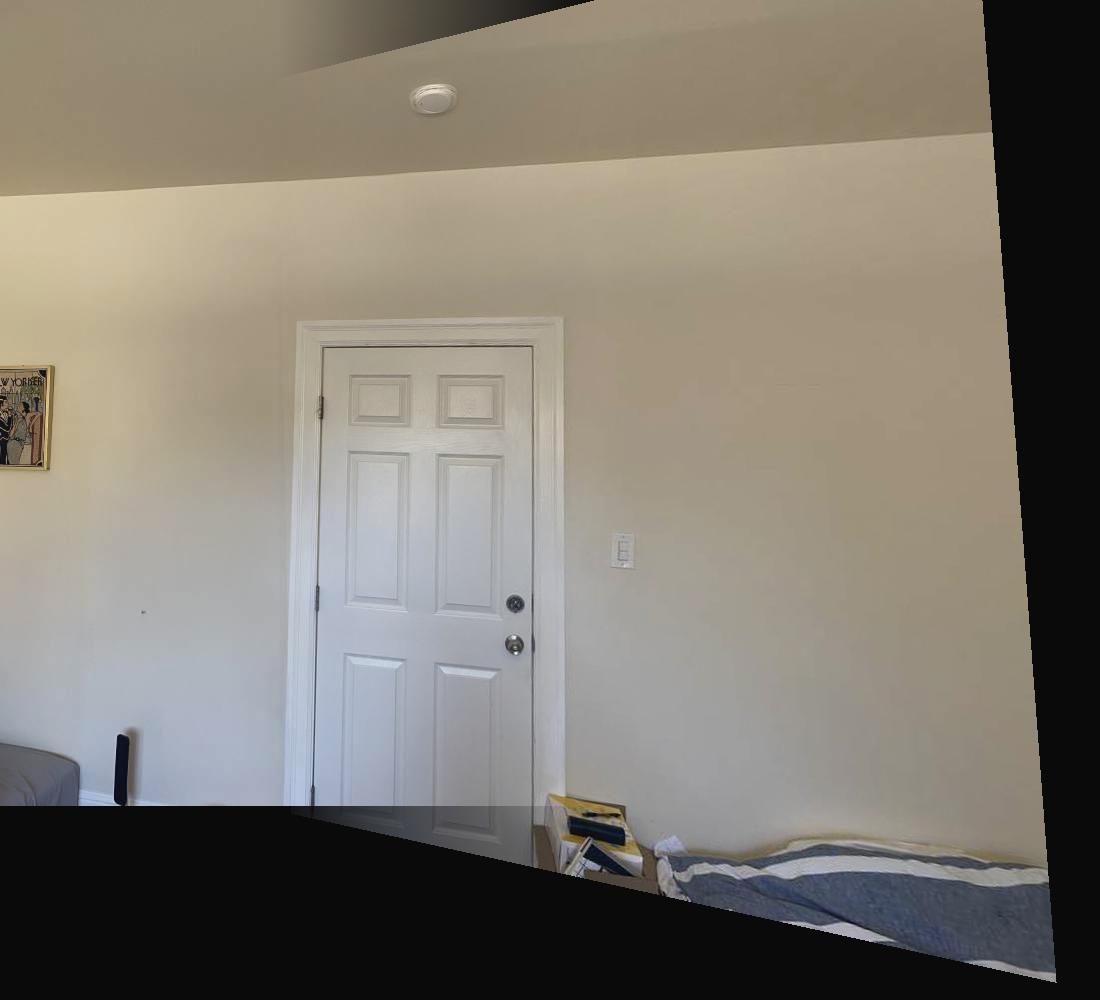
Now that we can successfully warp images, the next step is to take multiple images from the same spot (with the camera slightly rotated), and then stitching these images together to form a mosaic. For the first set of images, I took these photos by the building near Lewis hall.
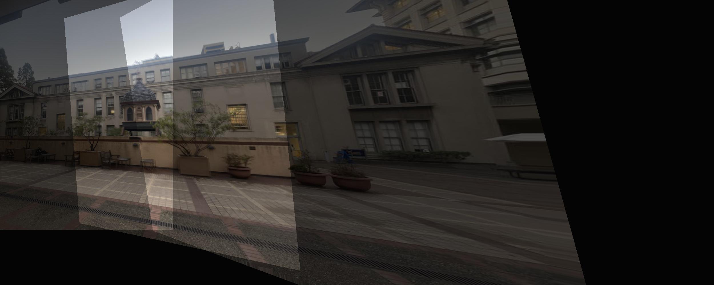
A naive overlapping of the images causes a strange coloration, so I gradually increased/decreased the alpha of 2 images to gradually blur from 1 image to the other. This makes the image coloration much better.
The bluring was the hardest part, and I ended up using a 1D blur (every pixel in the same column had the same alpha) so along x the image looks pretty clean. However, along y, along the top and bottom where only 1 image is present (most of that column is overlapping, but due to the warp the top or bottom only comes from 1 image), there are some awkward artifacts.
Another example, making a mosaic of a planar surface.
Another example, making a mosaic of a planar surface.

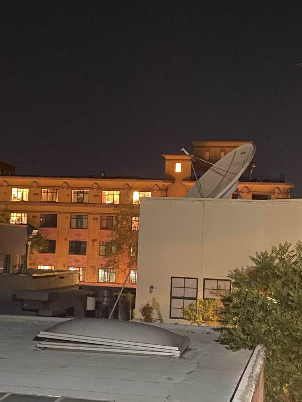
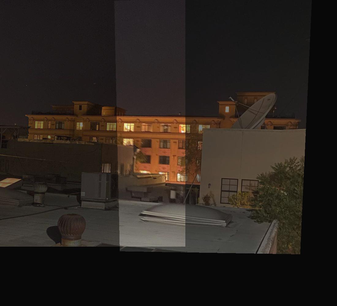
I tried taking these photos at night to see the difference, but it just ended up with the 2 photos having different lighting autmatically chosen by my iPhone. The bluring is still a lot better than a naive overlap, but a vertical line is still clearly visible.
tell us what you learned
I found the warping part to be really cool, as well as the mosaicing. For the homography section, I took the time to understand the derivation of the A matrix in Ax=b for least squares. I saw some resources online that kinda gave it away, but at first I couldn't figure out why it was structured that way so I started with the p' = H*p and really understood how the A matrix eventually got its structure (it had both an x and x') The alpha bluring took a lot of trial and error to get it to show 1 image with normal looking intensities instead of weird overlapping images or strange colorations or random transparent parts depending on how images overlap. I ended up just using a gradually increasing alpha along x when a new image was added to the mosiac, and that was merged with the old image and a gradually decreasing alpha. The end result is actually pretty good. I'm excited for the next part of the project, where we'll use automatic feature learnning, instead of having to manually click on features and figure out the corresponding pixel coordinates. Manual mosaicing required quite a bit of manual work to find corresponding points in the right coordinate systems, so the automatic detector will be really cool.
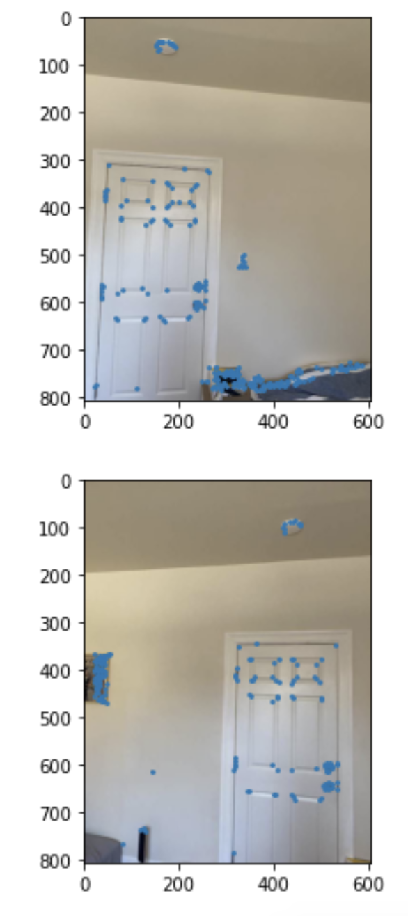
4B: Detecting Corner Features in an Image
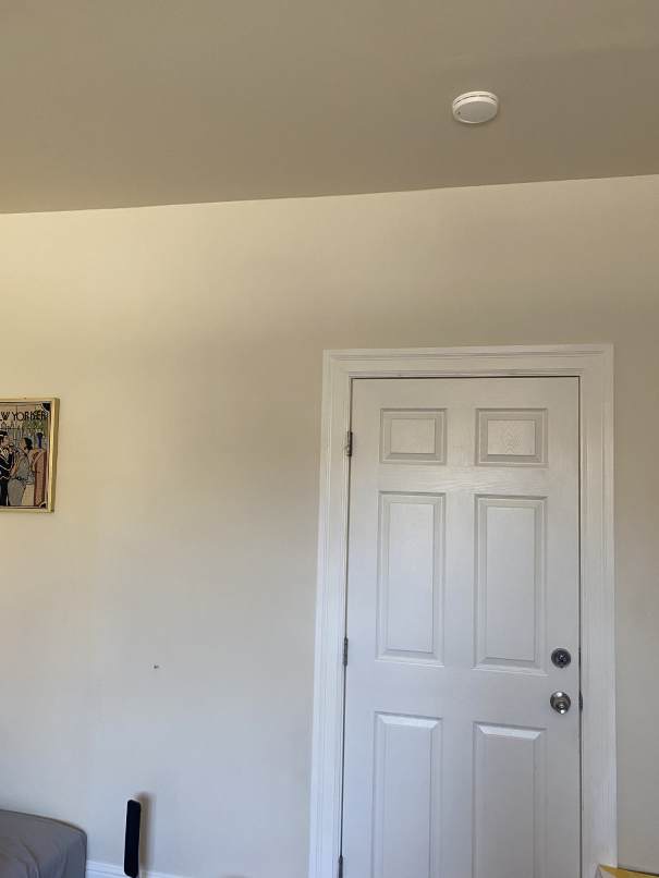
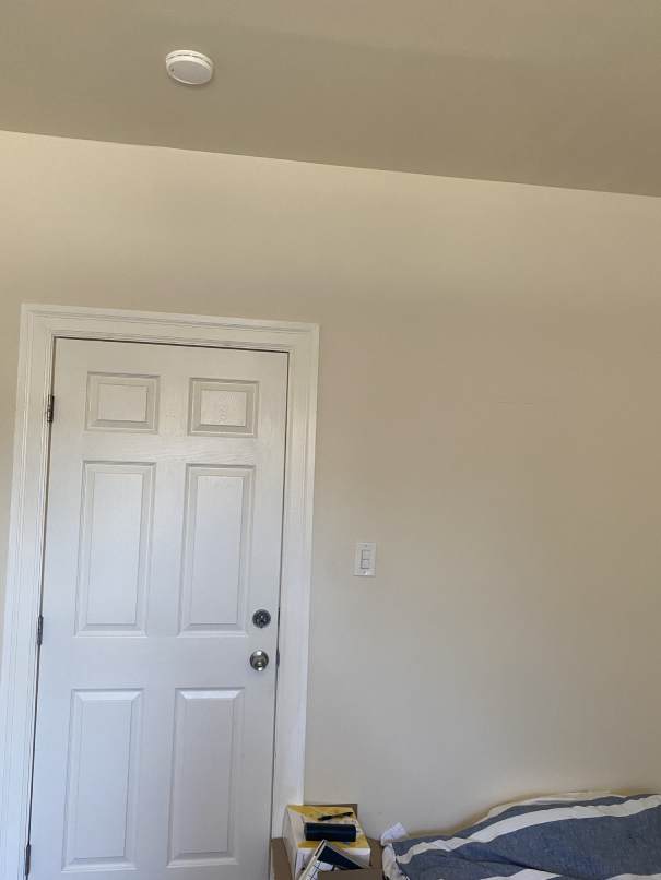
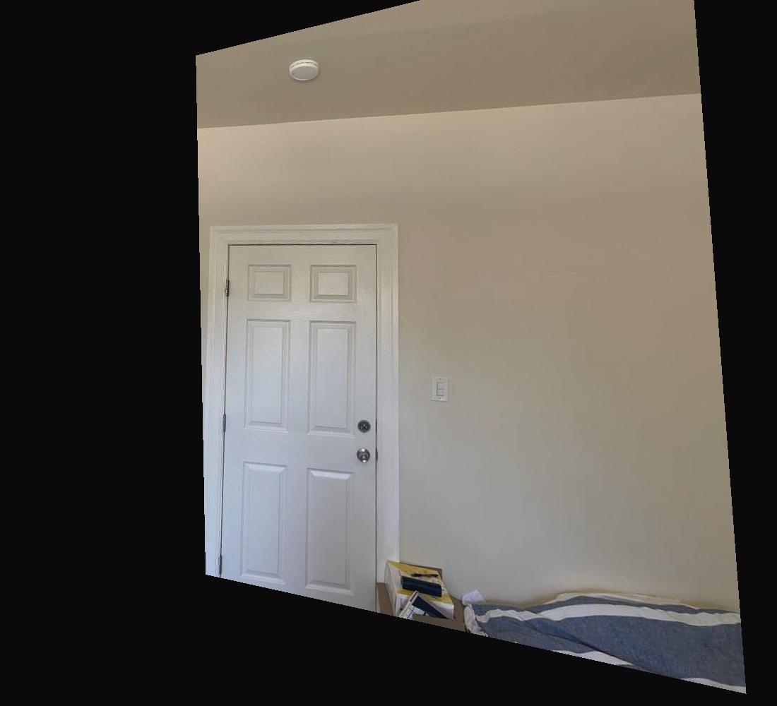
For this part, we use the Harris interest point detector to find corners of the image. Note that I did not do the Adaptive Non-Maximal Suppression part of this project. Here we see all the corners detected on 2 pictures of a door.
Extracting and Matching Feature Descriptors
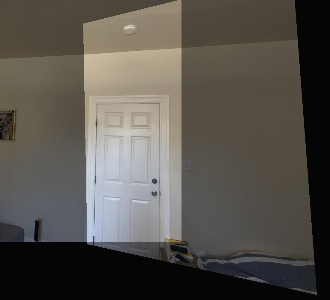
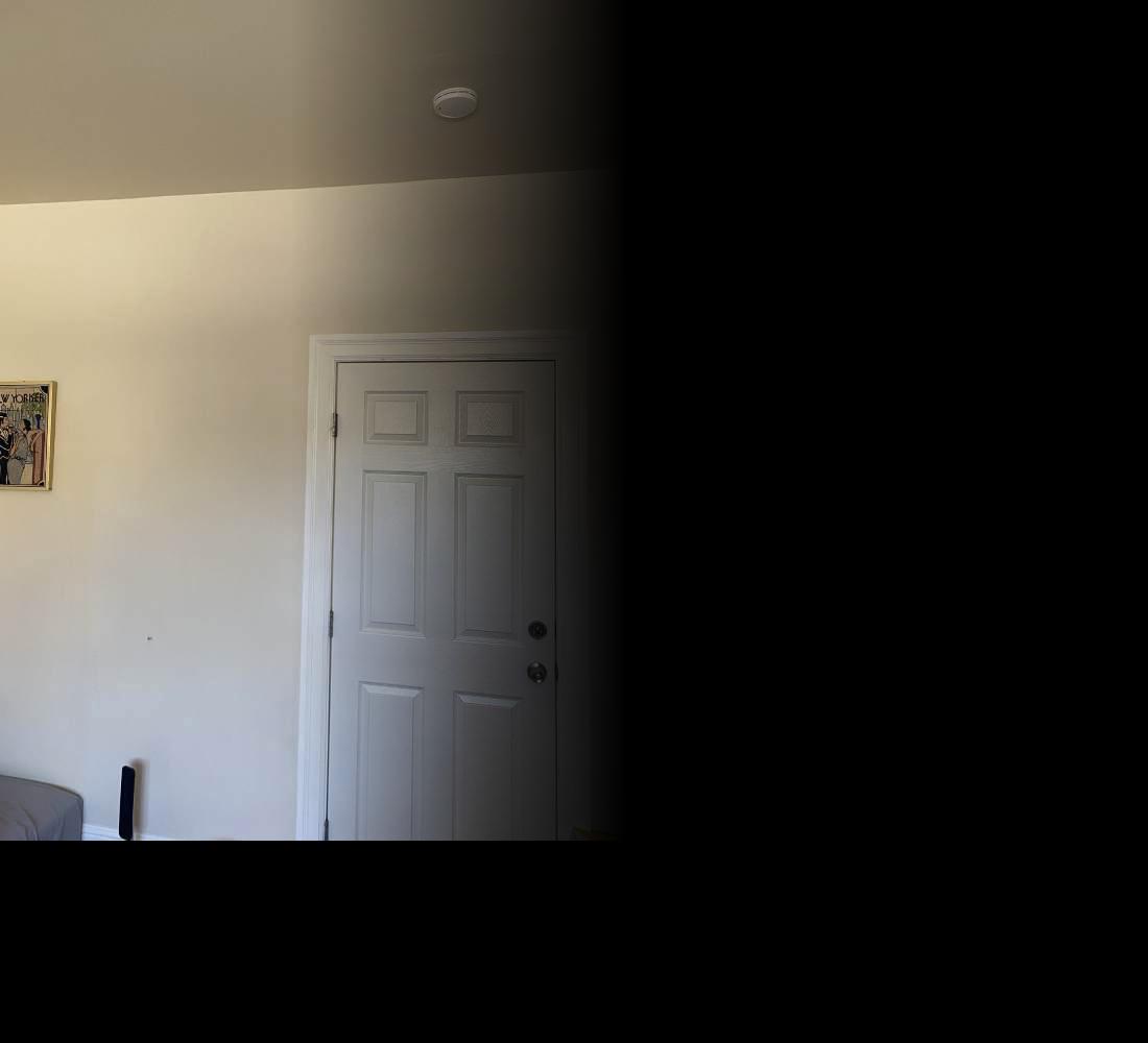
For each feature, we generate a feature descriptor according to section 4 of the paper. For feature matching, we use the Lowe threshold to see the ratio of the 1-NN and the 2-NN to find a strong matching descriptor. Finally, we use RANSAC to reject outliers. We choose 4 random features, and find the number of inliers. We repeat this numerous times to find which set of 4 has the most inliers. To get the best homography, we can then do least squares on the entire set of inliers to find the best transformation. Here is a comparison of the features matched in 2 images, after doing feature matching and outlier rejection. Each point on each image has a clear corresponding point on the other image. We also don't see any outliers, which is good because it means our transformation will be accurate.
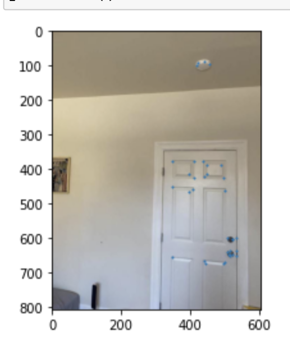
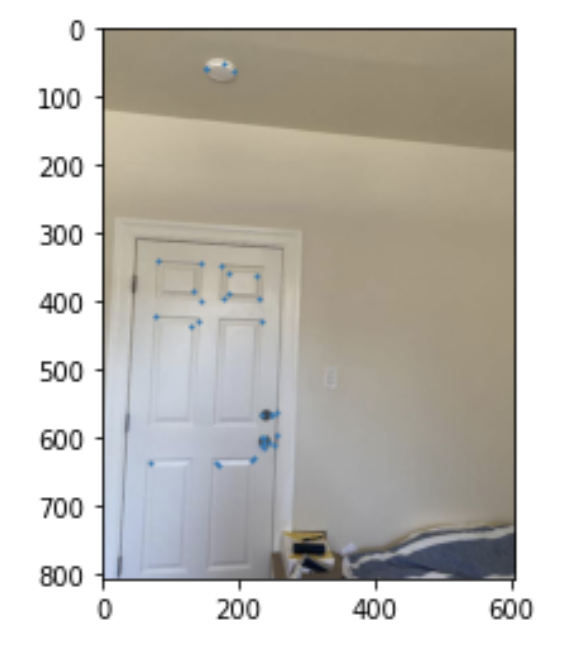
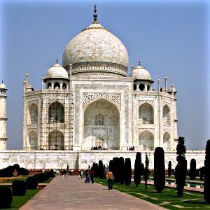
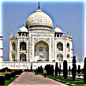
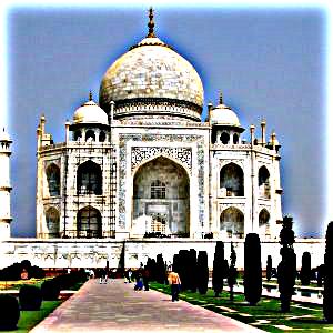
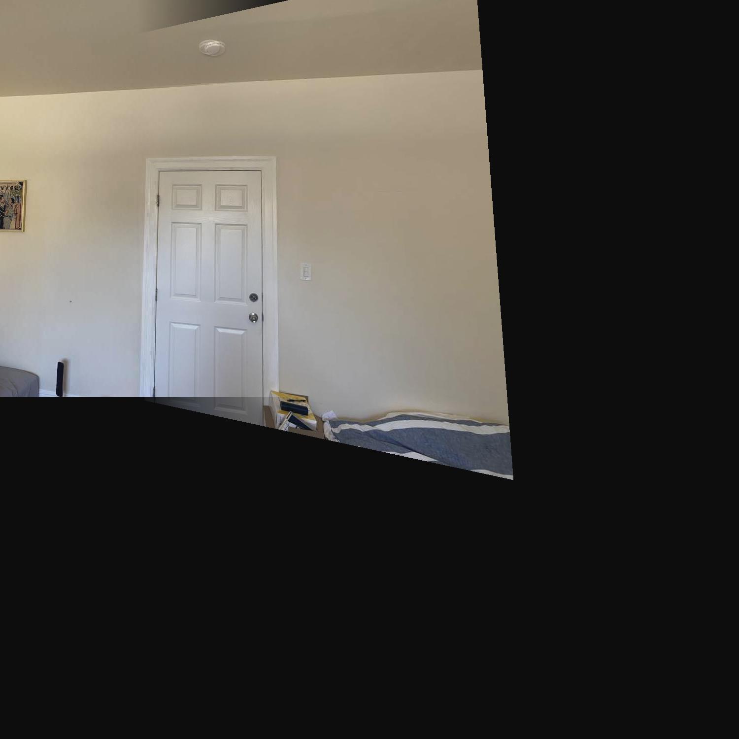
Image Mosaicing
Now we show a few image mosaics using automatic feature detection and stitching, with the same alpha blurring as in 4a.

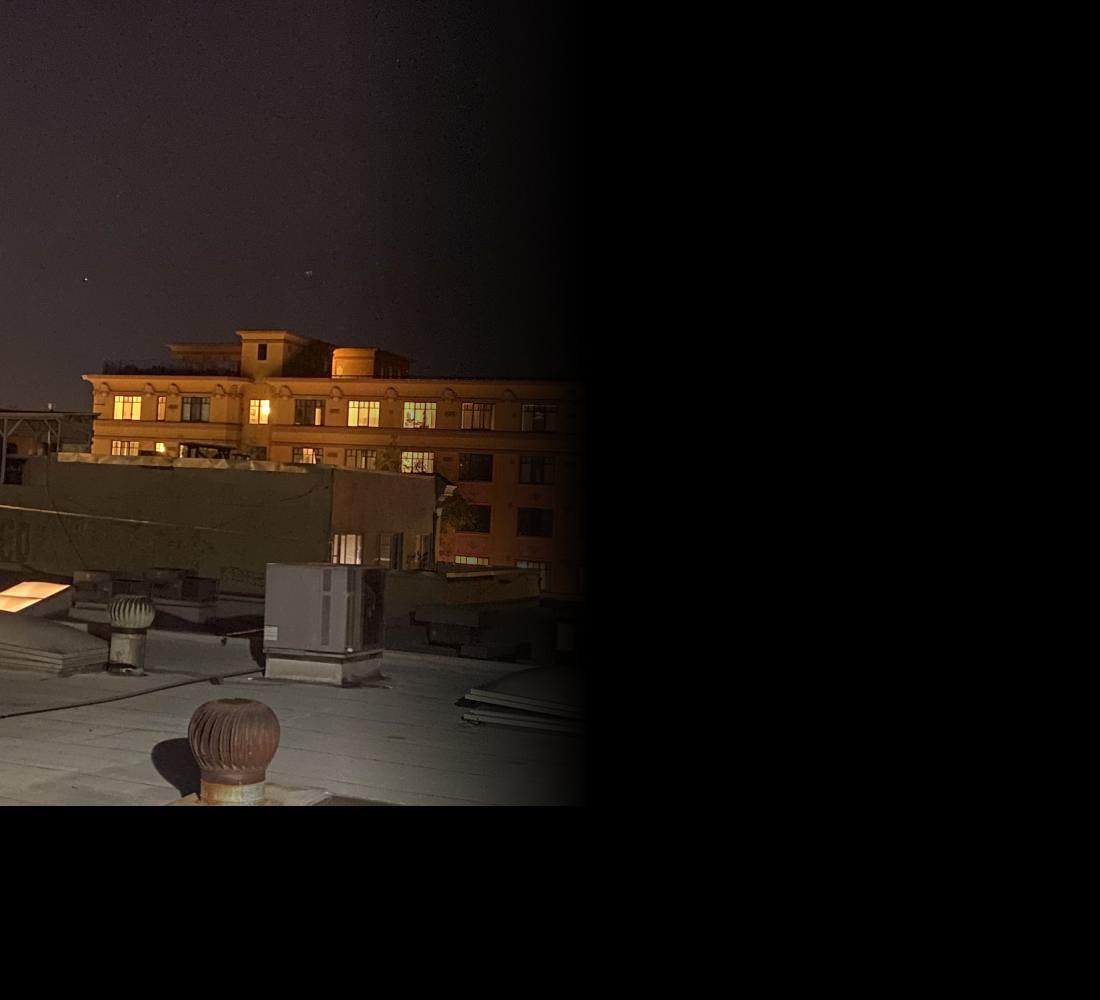
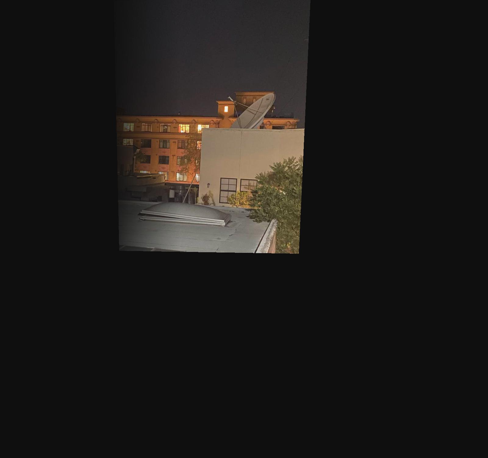
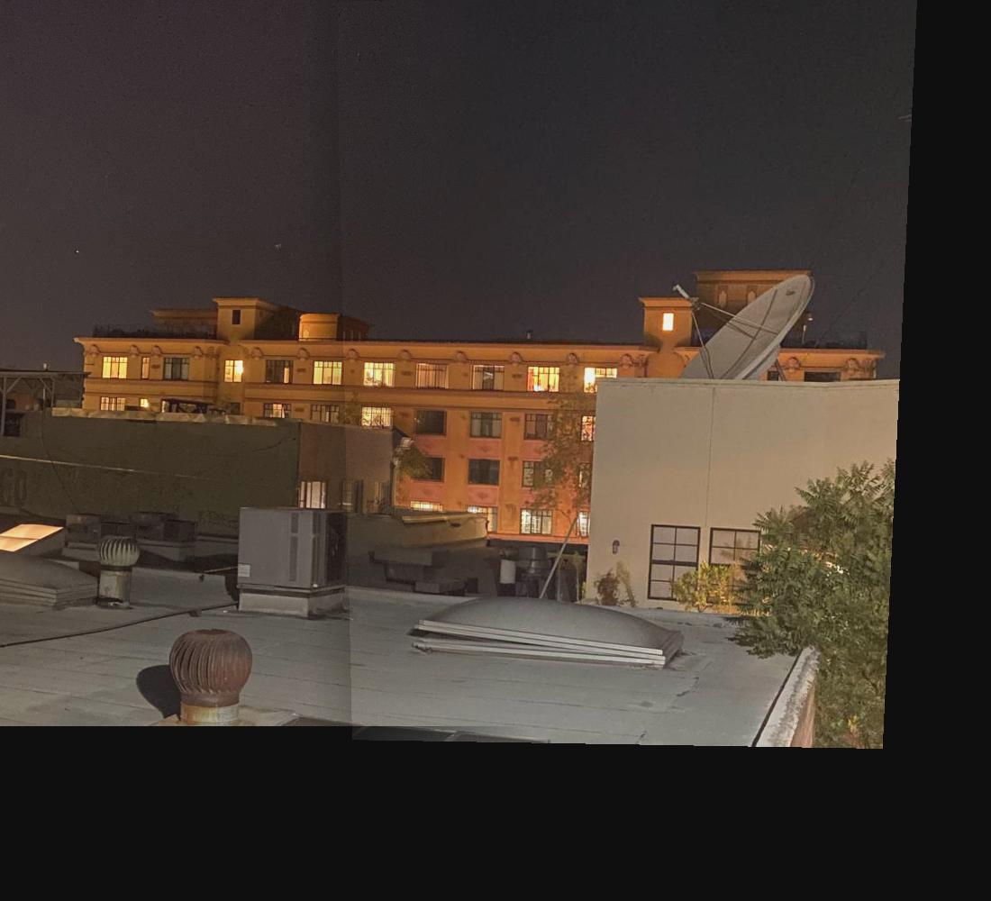
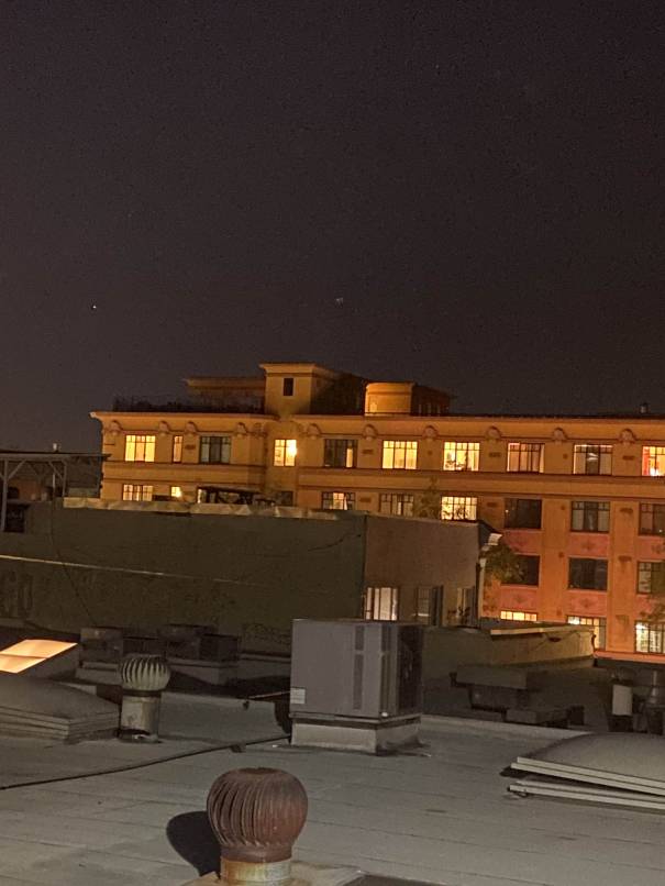
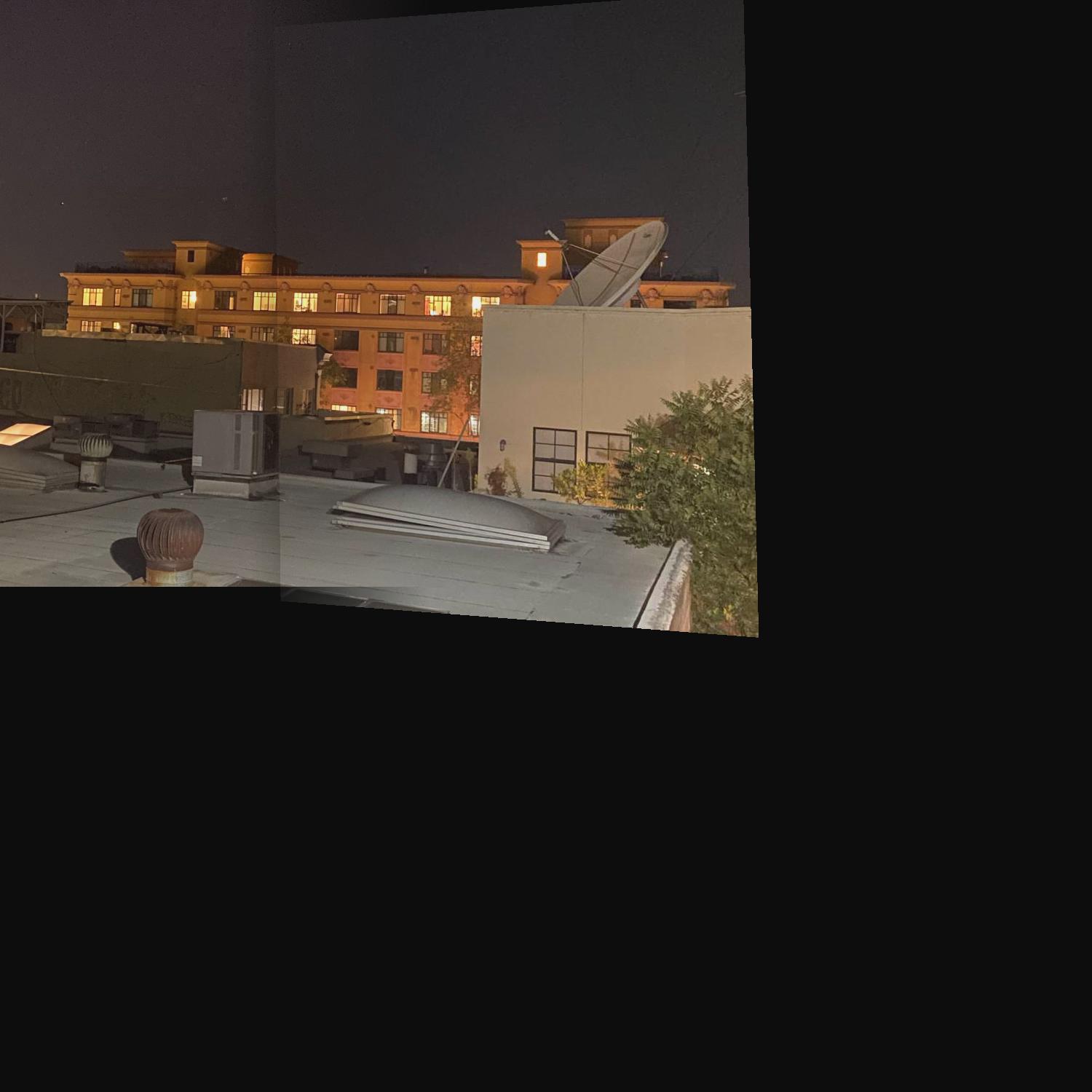
Now we look at a building at night. THe lighting seems to be a little off in the camera, so unfortunately there is a distinct line between the 2 images, even after alpha blurring.

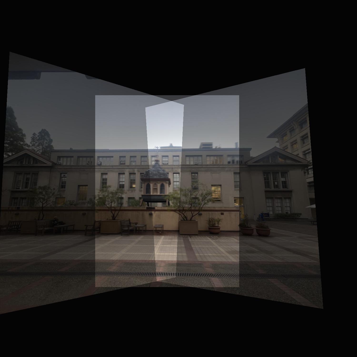
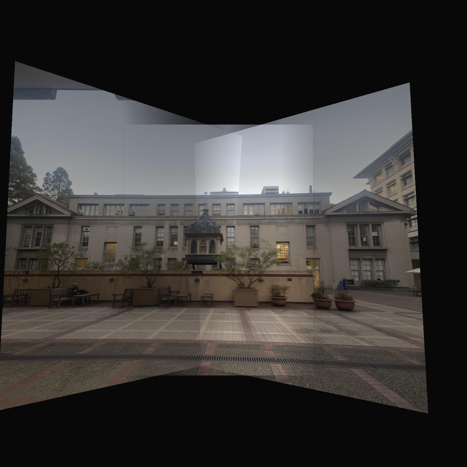
Finally, we mosaic a building. For the manual part, I stitched 3 images into 1. Instead of warping the leftmost and rightmost into the middle image, I first warped the middle into left, and then the right into the warped version of the middle. This worked well for the manual mosaicing. However, when I tried the same for automosaicing, it didnt work. This is because the warped Middle image has some rotation, so feature matching didnt work because my feature descriptors are not rotation invariant. So the same wwarping order didnt work. I have included an automosaic of just the middle image into the left image to show it looks similar to the manual mosaic. Additionally, for the automosaic, I also warped the left and right images into the middle image. THis allowed for all 3 images to be mosaiced together. However, this means the perspective is different from the 3 image manual mosaic.

What I learned
I think the automatic feature detection and matching is really cool. Finding manual correspondences is not convenient and not scalable so I really liked the automatic aspect of it. It made testing really easy because I didn't have to manually find coordinates of matching points. I switched the order of warping for the last mosaic, and auto-mosaicing made that really easy. Making each auto-mosaic was so much faster than each manual mosaic. The previous projects have been really cool, but didn't feel too useful. This project seemed actually useful because feature detection, matching, and outlier rejection all feel like something that have real world uses.